OMRON NB-Designer OPERATION MANUAL (NB-series, 2020) - page 4
3 Functions of NB-Designer
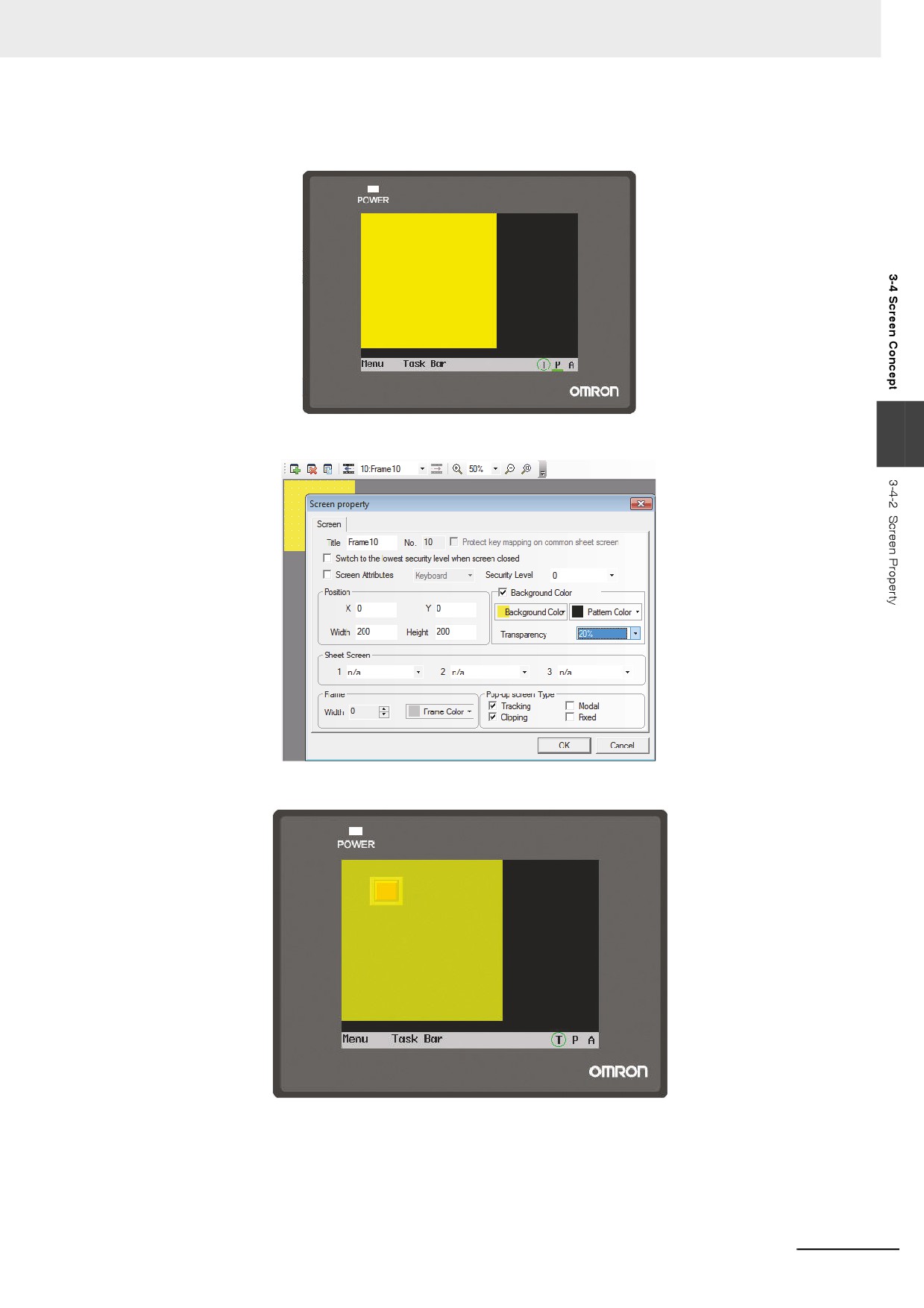
Press the function key and pop-up Frame 10 will cover the function key, which is caused by the
transparency of 0% for Frame 10, as shown below.
• When the transparency is 20%.
3
Perform the offline test and press the function key, the displayed effect is shown as below.
3-53
3 Functions of NB-Designer
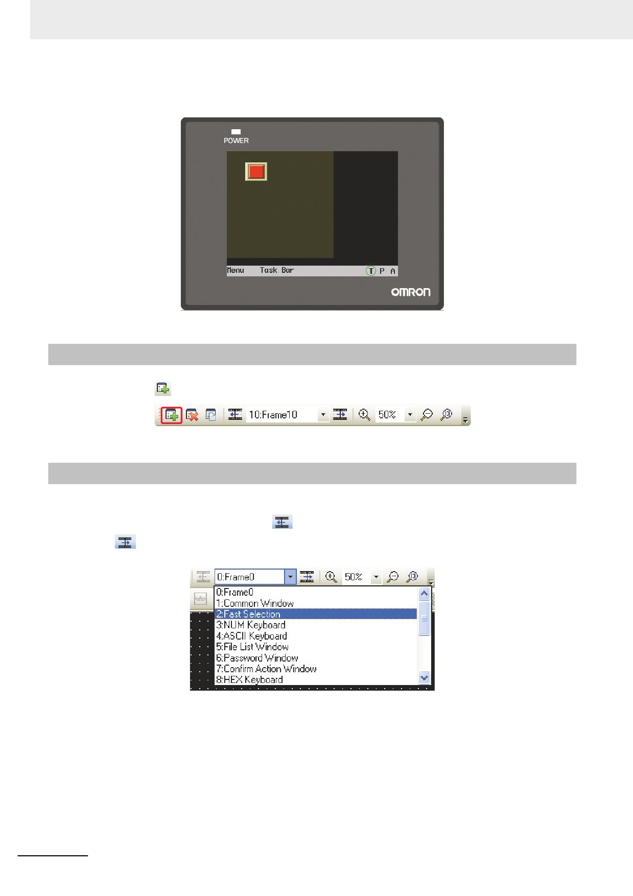
• When the transparency is 80%.
Perform the offline test and the effect is as shown below.
3-4-3
Screen Creation
Clicking the
icon in [Screen Toolbar] can create a new screen.
3-4-4
Screen Opening
After the screen is created, the previous screen can be displayed by selecting it in the pull-down menu
in [Screen Toolbar] or by clicking the
icon, and the next screen can be displayed by clicking
the
icon. If the mouse with the roller is used, the screen No. can be changed directly by using the
roller.
3-54
3 Functions of NB-Designer
3-4-5
Screen Deletion
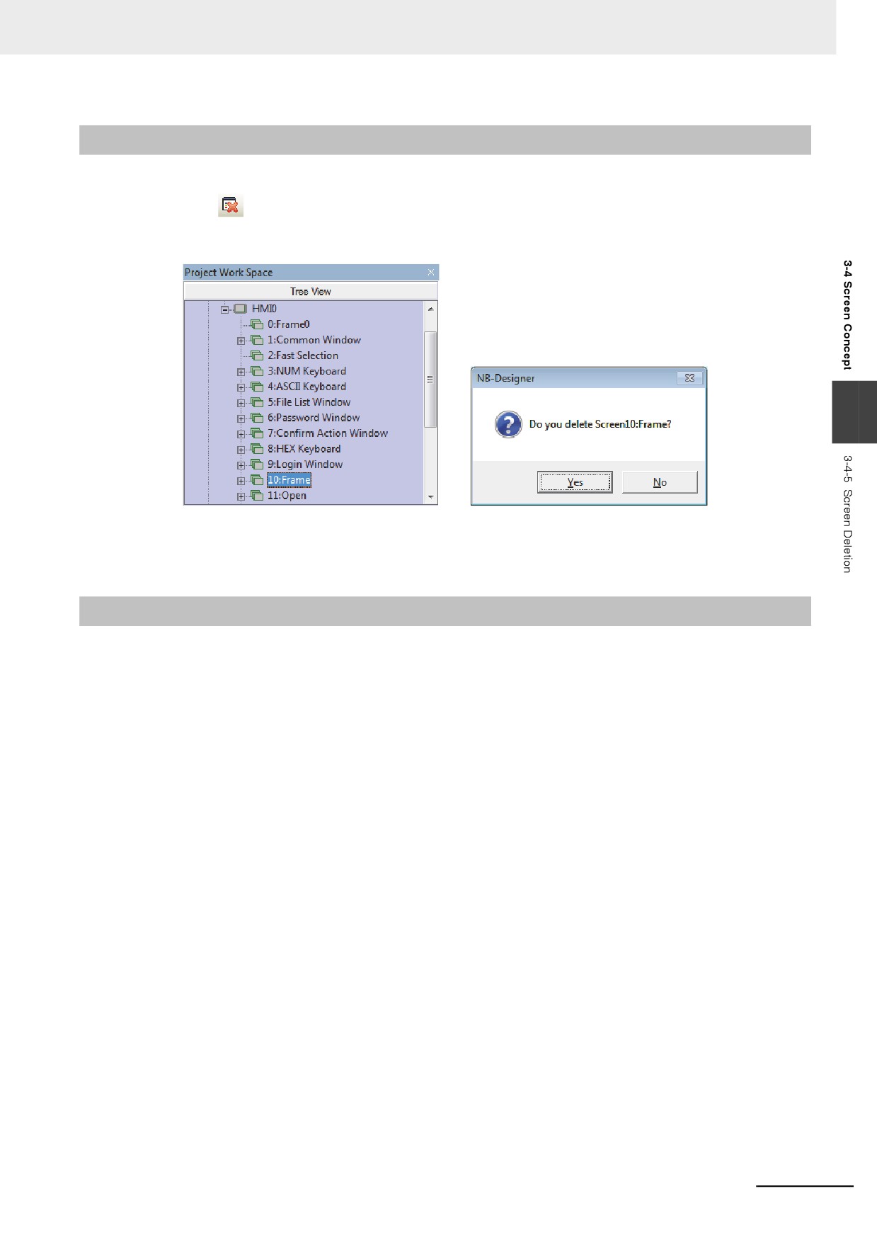
In Project Work Space, select the screen No. to be deleted, and press the “Delete” key in the keyboard
or click the
icon in [Screen Toolbar]. When the Confirm Screen pops up, select “Yes” to delete this
screen, and all the components in this screen will be deleted and can’t be restored. Please be careful
when you use this function.
3
Note Frame 0, Frame 1 to Frame 9 are all the default screens for the system, and they are not allowed to be
deleted.
3-4-6
Components Related to Screen
The function keys which are directly related to the screen operations include: Change Screen,
Backward, Change Common Screen, Pop-up Screen and Change Menu Screen. Components which
are directly related to the screen operations include: Direct Screen and Indirect Screen. For the
contents of these components, refer to 3-6-16 Indirect Screen (Page 3-147) and 3-6-17 Direct Screen
(Page 3-150).
3-55
3 Functions of NB-Designer
3-5
Basic Design Method
3-5-1
Designing Components
Generally speaking, one screen includes various kinds of components such as switches, lamps,
number input and shapes. It is simple to add one component to the screen, and it is basically divided
into 3 procedures as shown below.
z Component Addition
1
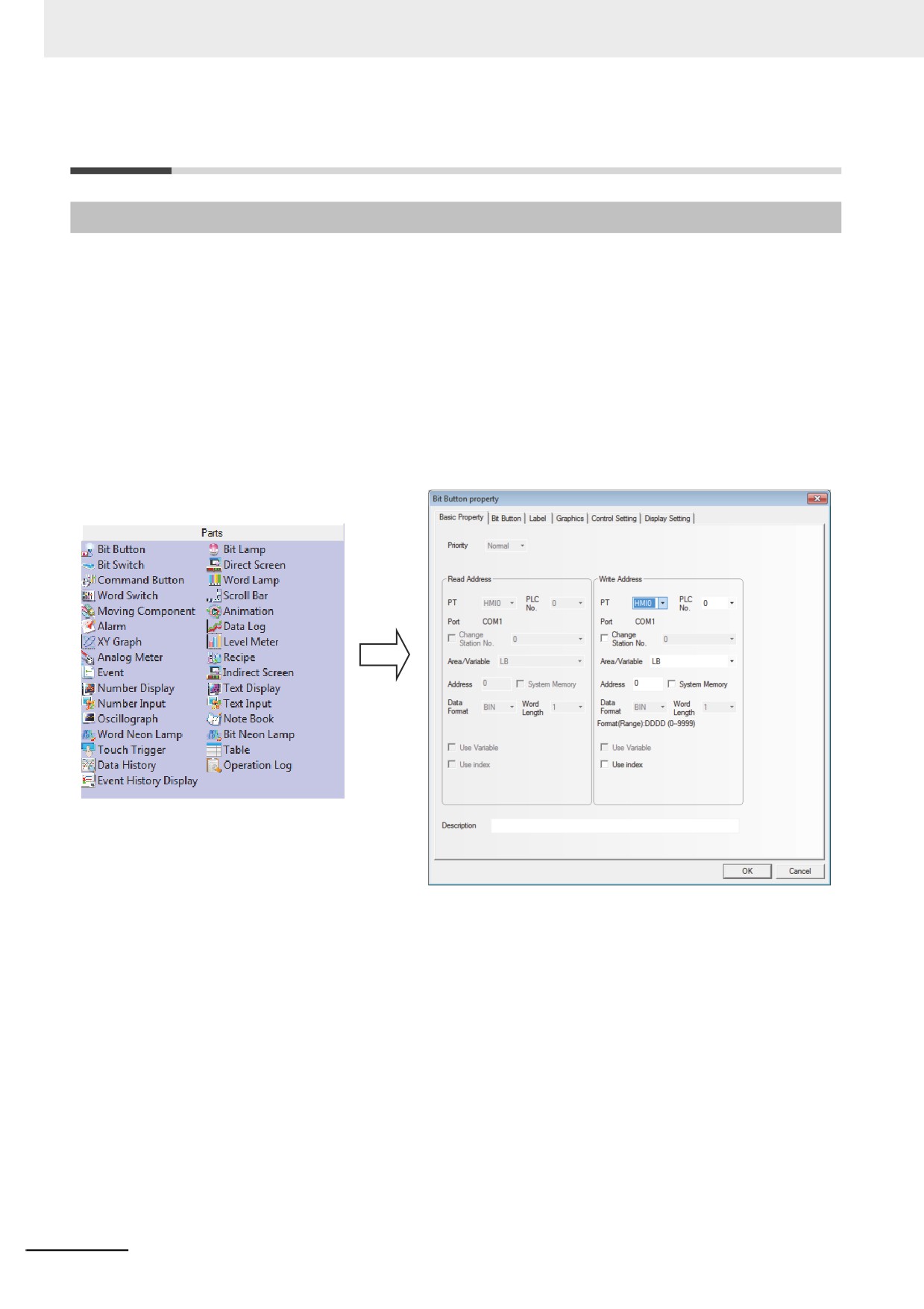
Drag the component icon from [Project Library Window]-[Parts] to the Edit Window.
2
When the Property dialog box of this component appears, set the various Properties for this
component such as PLC Read/Write Address, Vector Graphics or Bitmap, Label and Position
etc.
3
After the various Properties of this component are set, click the [OK] button. And you can see
this component has been placed in the screen after exiting from this dialog box. If required, you
can adjust the size of the component by changing settings in “Position” in “Display Setting” tab
or drag it to the desired position.
3-56
3 Functions of NB-Designer
3-5-2
About ID No.
ID No. is the number automatically assigned to the component for differentiating the components on the
PT. The designer cannot change component ID number artificially.
The contents represented by ID No. are as follows:
BL0
0: Component No,
BL: Bit
Lamp
Parts:
SB: Bit Button
BL: Bit Lamp
3
SW: Bit Switch
DW: Direct Screen
SWD: Command Button
WL: Word Lamp
MSW: Word Switch
SCR: Scroll Bar
MV: Moving Component
ANI: Animation
AD: Alarm
TR: Data Log
XY: XY Graph
BR: Level Meter
MT: Analog Meter
RCP: Recipe
ED: Event
IDW: Indirect Screen
ND: Number Display
TD: Text Display
NI: Number Input
TI: Text Input
OS: Oscillograph
NB: Note Book
NL: Word Neon Lamp
BNL: Bit Neon Lamp
TT: Touch Trigger
GR: Table
HDD: Data History
3-57
3 Functions of NB-Designer
Function Parts:
SC: Scale
FK: Function Key
AB: Alarm Display
TM: Timer
BG: Bitmap
VG: Vector Graphic
NP: Notepad
DT: Data Transmission
VM: Freeplotting
DTM: Date/Time Display
DG: Indirect Shape
UID: User Information
CO: Multifunction
EB: Event Display
3-5-3
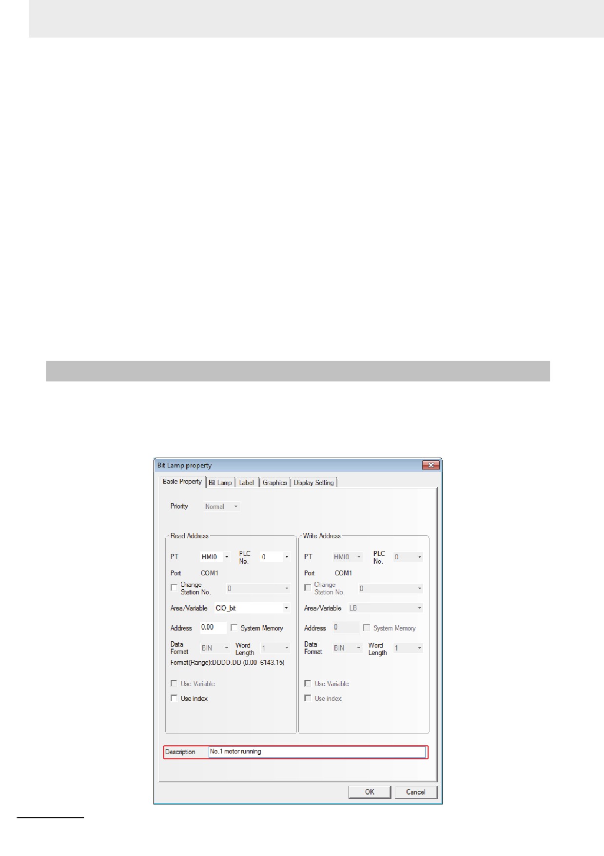
Additional Comments (Descriptions)
If necessary, you can add comments to each component. The comments are used for entering remarks
or descriptions of the program on creation. Therefore, the descriptions entered as the comments will be
referred in future or the text entered will be used to describe when the text is printing. The entered
comments will not cause any effects to the program. (The NB-Designer does not support comment
printing.)
3-58
3 Functions of NB-Designer
3-5-4
Read/Write Address for PLC
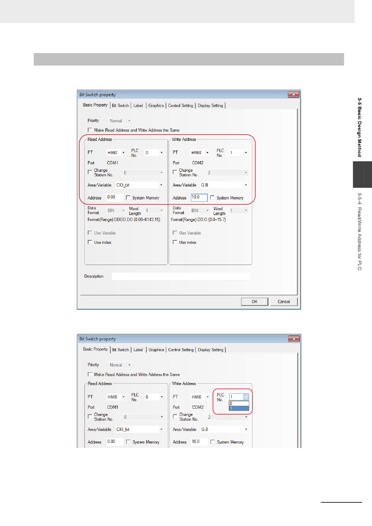
The correct area and address range vary with the PLC. In the following figure, PLC0 is manufactured
by OMRON, while PLC1 is manufactured by SIEMENS, so their addresses are different.
3
All the available PLC devices can be displayed in the pull-down menu corresponding to “PLC No.”
option.
3-59
3 Functions of NB-Designer
The internal memory can be also selected, And the descriptions of internal memory are as follows:
Type
Device Name
Range
Descriptions
Bit
LB
0~9999
The address of the local memory
Bit
RBI
0.0~261000.F(*1)
The index address of the recipe memory that is
stored in the flash memory in D.H. format and H
ranges from 0 to 15.
Bit
RB
0.0~261000.F(*1)
The absolute address of the recipe memory that
is stored in the flash memory in D.H. format and
H ranges from 0 to 15.
Bit
FRB
0.0~134217727.F
The absolute address of the flash memory in
D.H. format and H ranges from 0 to 15.
Bit
FRBI
0.0~134217727.F
The index address of the flash memory in D.H.
format and H ranges from 0 to 15.
Bit
LW.B
0.0~10255.F
The address of the local memory in D.H. format
and H ranges from 0 to 15.
Word
LW
0~10255
The address of the local memory
Word
RWI
0~261000(*2)
The index address of the recipe memory that is
stored in the flash memory
Word
RW
0~261000(*2)
The absolute address of the recipe memory that
is stored in the flash memory
Word
FRW
0~134217727
The absolute address of the flash memory
Word
FRWI
0~134217727
The index address of the flash memory
Word
ERW0~ERW2
0~2147483647
External Recipe Word Memory is available by
connection with the external memory.
RB and RW point to the same area. For example, RB5.0~RB5.15 and RW5 map the same area, i.e.
RB5.0 is the Bit0 of RW5. But the addresses pointed by LB and LW in the memory are different,
because they map the different areas.
The memory addresses of LB9000~LB9999 in LB, LW.B9000.0~LW.B10255.F in LW.B, and
LW9000~LW10255 in LW are reserved by the system internally for some special purposes, and the
users can’t use them as the addresses for the common devices, but should use their special functions
according to the related manuals. For details, refer to 3-11 Address of System Memory (Page 3-328).
When the recipe memory is accessed by the index address, the index address will begin to search from the address
of the offset of the address displayed by LW9000. For example: If LW9000 is 50, the index address RWI100 will
access the data in the address of RW150 (100+50). (For details, refer to 3-12 Recipe Data (Page 3-343).)
*1
When using NB3Q-TW01B or NB5Q-TW01B, the range of addresses is 0.0 to 130500.F.
*2
When using NB3Q-TW01B or NB5Q-TW01B, the range of addresses is 0 to 130500.
3-5-5
Vector Graphic
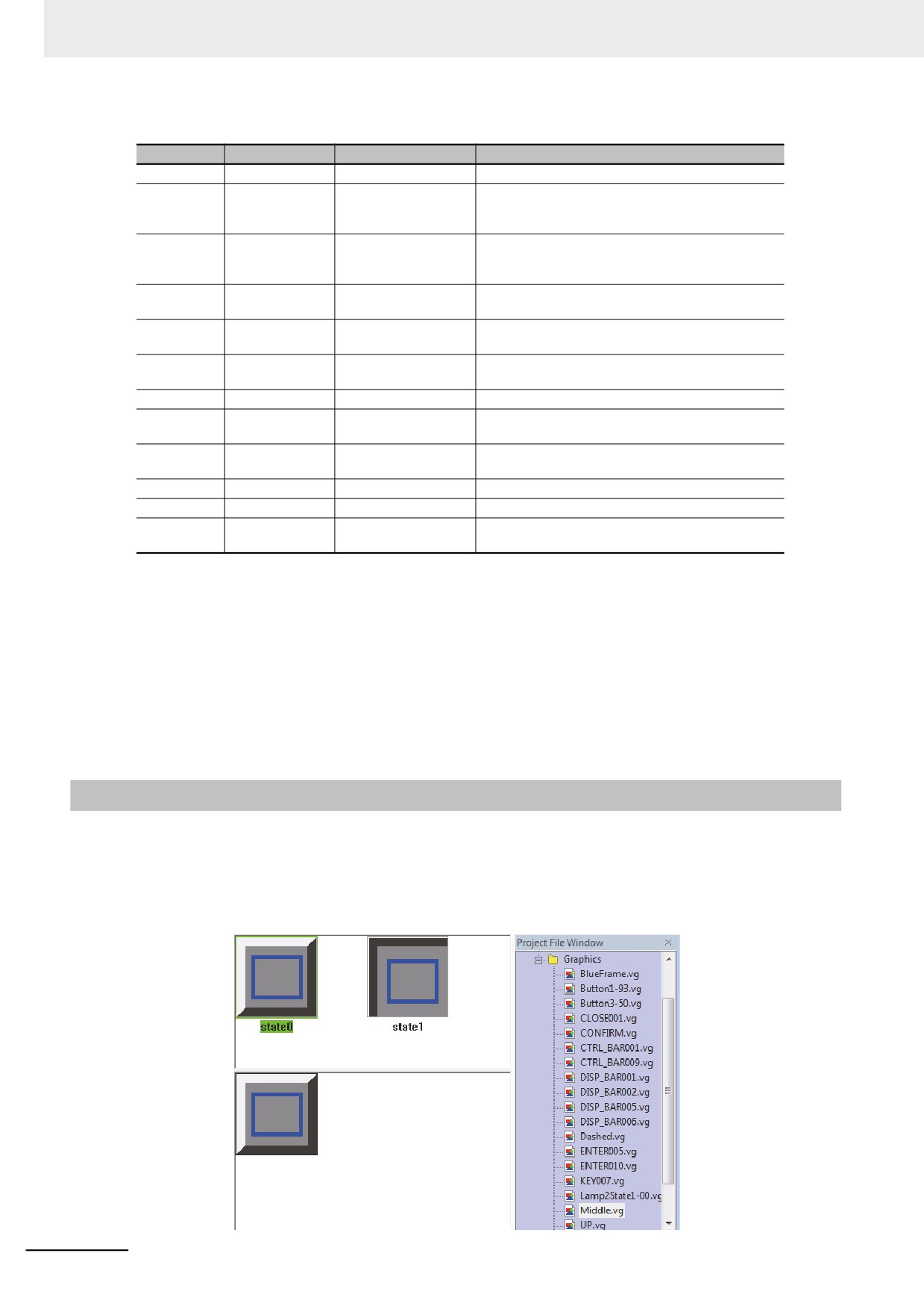
NB-Designer provides the powerful Vector Graphics and bitmap library, and you can create any desired
graphics (such as switch, lamp, piping etc.) in the library and even you can add your own pictures to the
library. The graphics can be 256-color bitmap, 16-color bitmap, 32-color bitmap or in JPG, BMP, GIF
and PNG format. Every vector graphics or bitmap can create 256 statuses. The created Vector
Graphics and bitmap are in [Graphics] in [Project File Window], as shown below:
3-60
3 Functions of NB-Designer
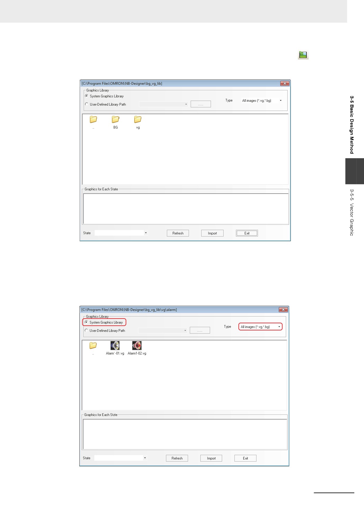
Of course, you can use the graphics library provided by the system. When you click the
[Import
Graphics] icon in the toolbar, the following dialog box will pop up:
3
The system graphics library is located in bg_vg_lib\VG directory in which the NB-Designer was installed
and all the graphics are stored in the folders for each item. Select the Vector Graphics to be imported,
and click “Import”, then the Vector Graphics will be copied into the “vg” file of the current project.
Importing multiple Vector Graphics or bitmaps simultaneously is not supported and only one graphics in
the same folder can be selected at a time before “Import” is clicked. All the imported or created Vector
Graphics or bitmaps by the user in the whole project will be displayed in the [Vector Graphic] in [Project
File Window] to facilitate the user to view and use them.
The vector graphics can be used as static images or the images representing the status of various
components.
3-61
3 Functions of NB-Designer
z Procedure of Vector Graphics addition
1
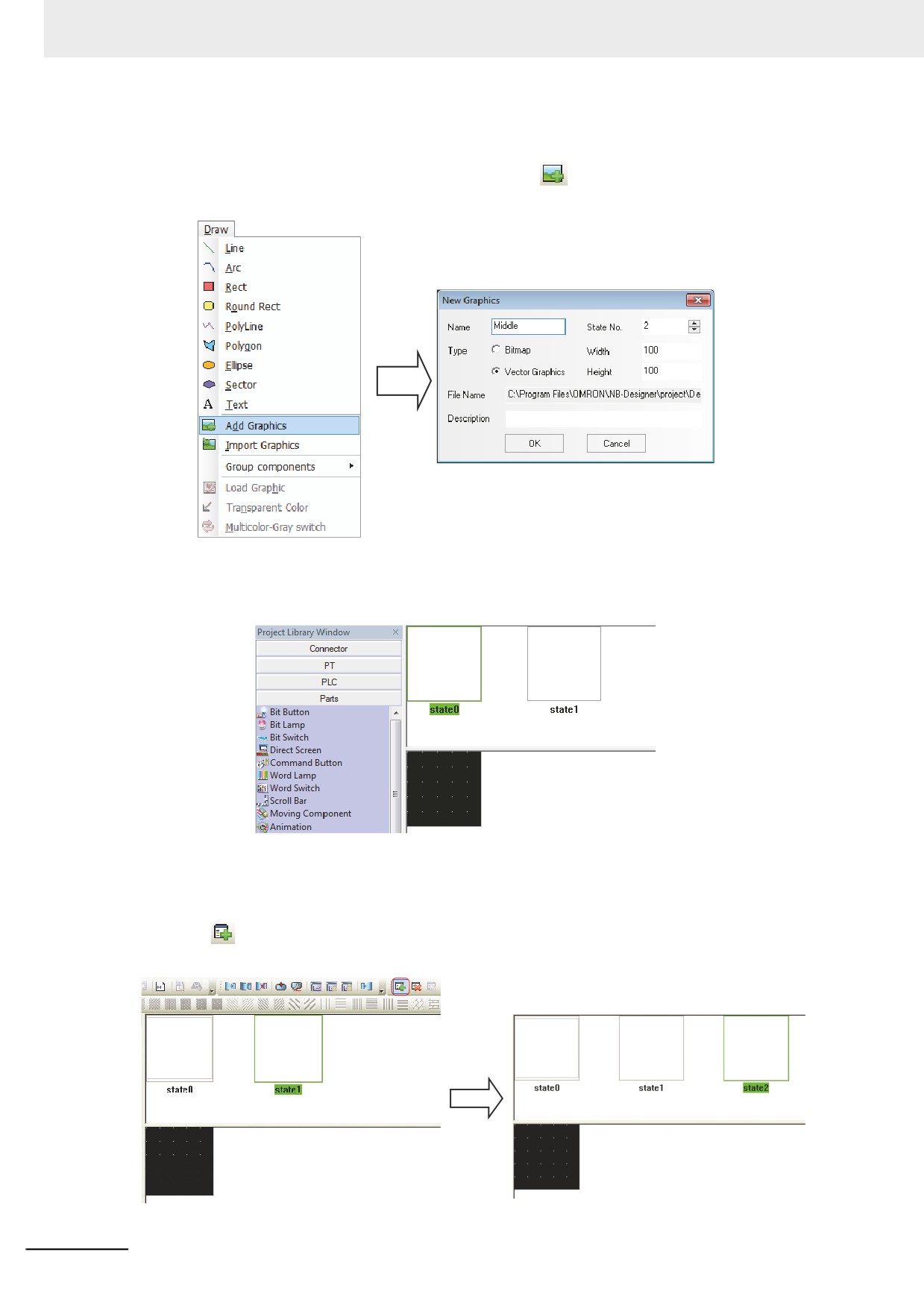
Select [Add Graphics] in the [Draw] menu or click
icon in the toolbar, and then the
following dialog box will appear.
2
Input the Name, State No. and Description for the Vector Graphics (For example: To create a
Vector Graphics with the name of “Middle” and the state No. of “2”), and click “OK”, then the
following dialog box will appear:
If you think the Vector Graphics states added just now are not enough, you can use the following
methods to make addition:
Drag the mouse into State Preview Window of the Vector Graphics, select one state such as “state0”,
then click
icon in the toolbar to create a new state. And the states that can be created are up to
256 kinds.
3-62
3 Functions of NB-Designer
3
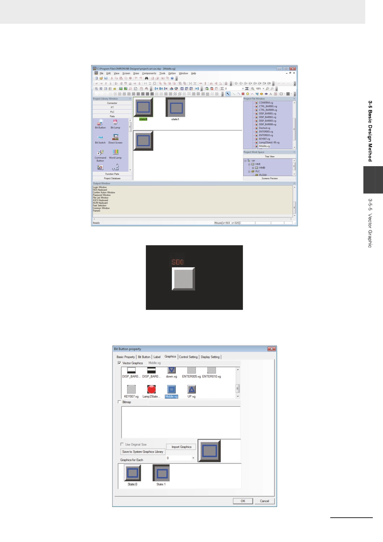
Create the graphics displayed in these two statuses, and then save the project.
3
4
Go back to the Edit Window, and select one component, as shown below:
5
Check [Vector Graphics] in the [Graphics] tab of Bit Button Property dialog box, and find the
name of the graphics created just now in the list, and then you can check the graphics at the
specific status each.
3-63
3 Functions of NB-Designer
6
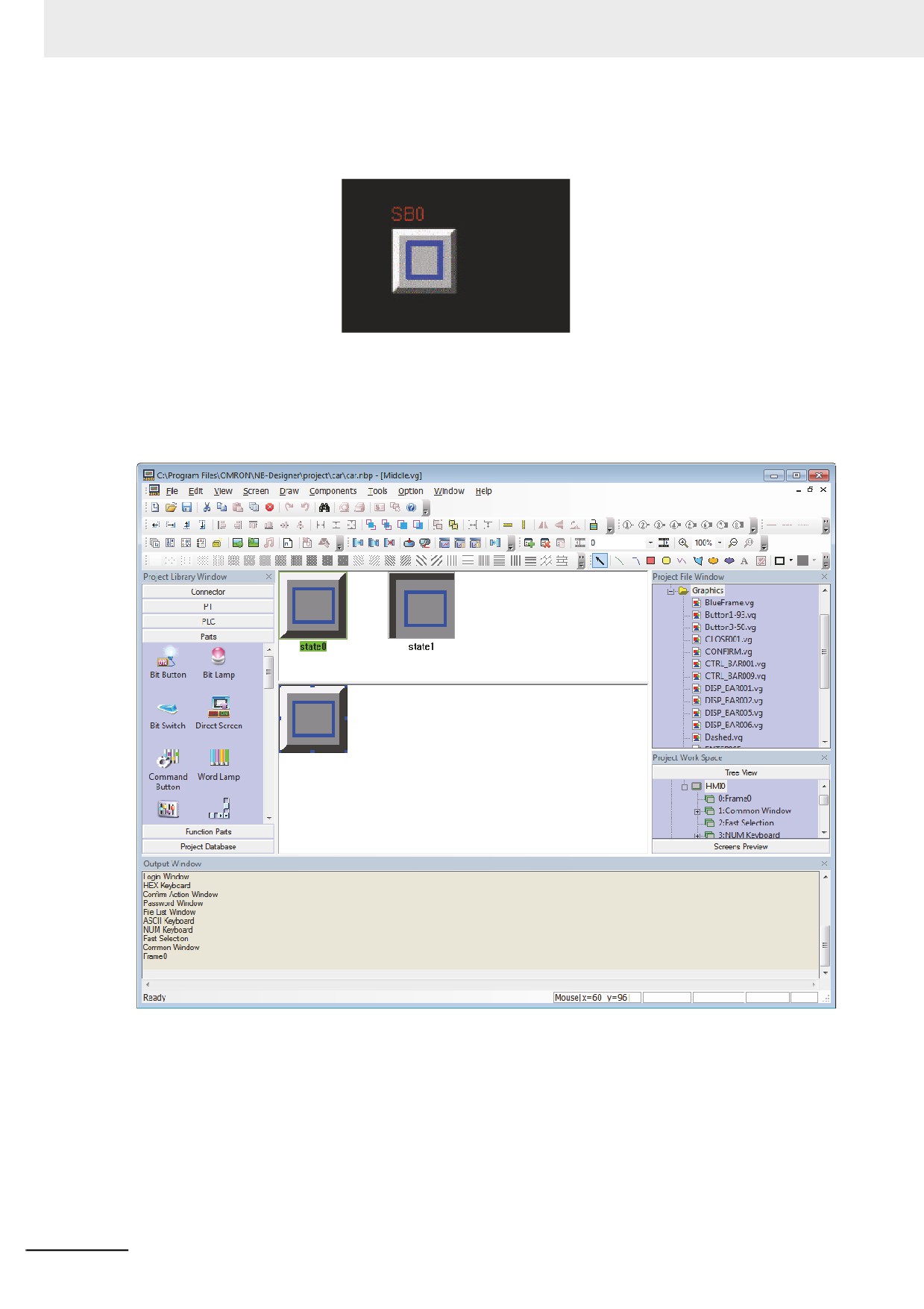
Click the [OK] button to exit from this dialog box, and this component will be displayed as the
selected Vector Graphics and placed in the screen.
All the Vector Graphics imported into the project will be displayed in the [Project File Window].
If you want to modify any Vector Graphics or bitmap, you just need to find the graphics to be modified in
the Vector Graphic in the Project File Window, and double-click it to open the Edit Window of this
graphics, where you can modify the graphics drawn by yourself.
Note 1
When the new graphics was created, the project should be saved to keep the contents. Otherwise the con-
tent will be lost.
2
No text can be added to the Vector Graphics.
3-64
3 Functions of NB-Designer
3-5-6
Bitmap
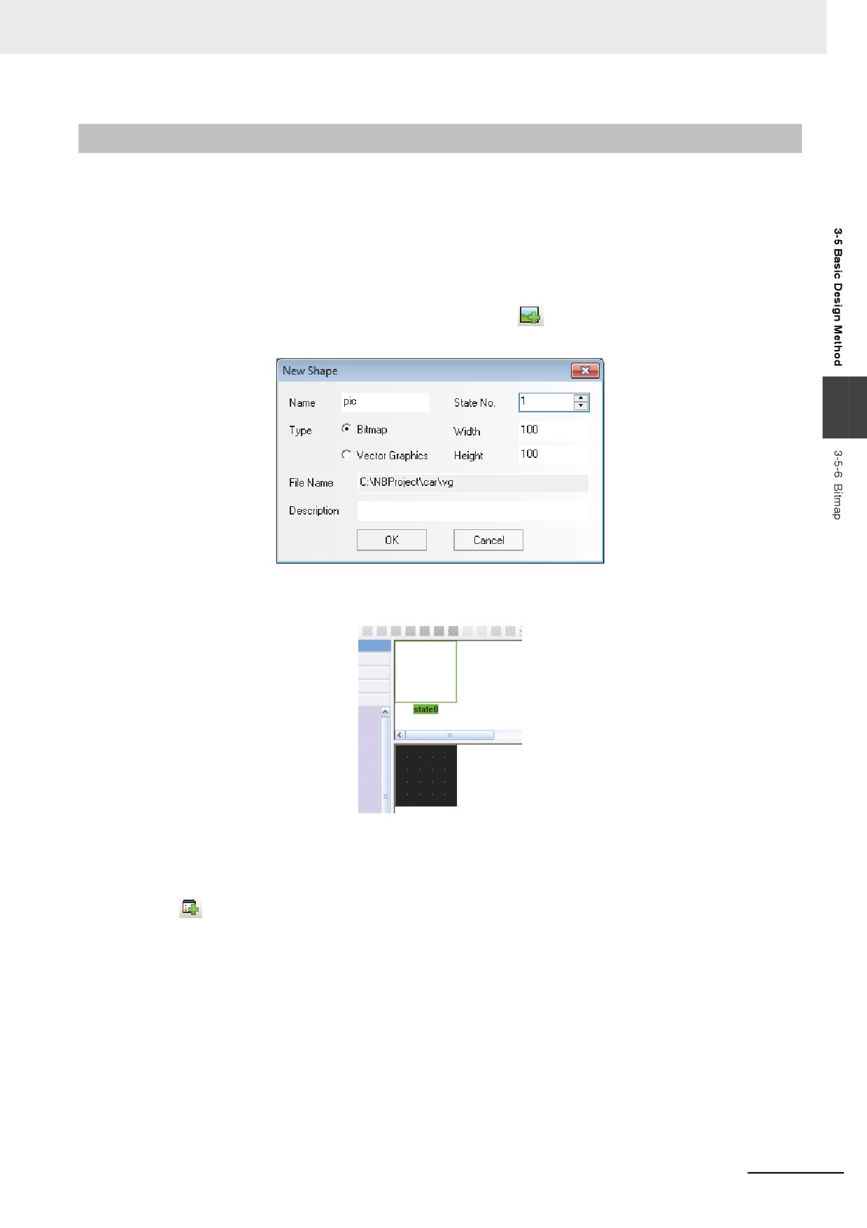
One bitmap includes 256 kinds of states and the created bitmap can be used in the Edit Window. The
bitmap is mainly applicable to graphic area, i.e. external graphics addition.
Note The operations (such as line-drawing, drawing, text addition etc.) for the bitmaps can’t be made in the
Graphics Edit Window, and only the external graphics addition can be done.
z Procedure of bitmap addition
1
Select [Add Graphics] in the [Draw] menu or click
icon, and then the following dialog box
will appear.
3
2
Select [Bitmap] in the “Type”, and input “State No.” and “Name”, then click “OK”.
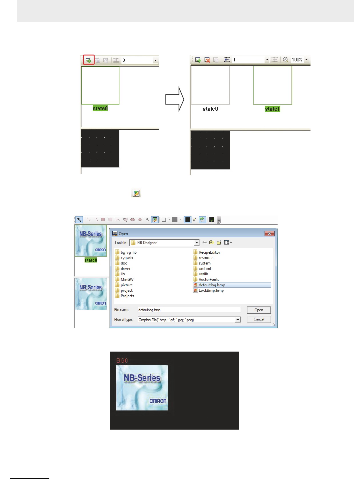
If you think the bitmap state added just now is not enough, you can use the following methods to make
addition:
Drag the mouse into State Preview Window of the bitmap, select one state such as “state0”, then
click
icon in the toolbar to create a new state. And the states that can be created are up to 256
kinds.
3-65
3 Functions of NB-Designer
3
Click [Draw Toolbar]
icon, find the needed graphics, and click it to open it. Only the
pictures can be input into bitmap and the tools such as “Line” can’t be used in the bitmap, as
shown below.
4
After the project is saved, you can use it through the bitmap component in the Edit Window.
3-66
3 Functions of NB-Designer
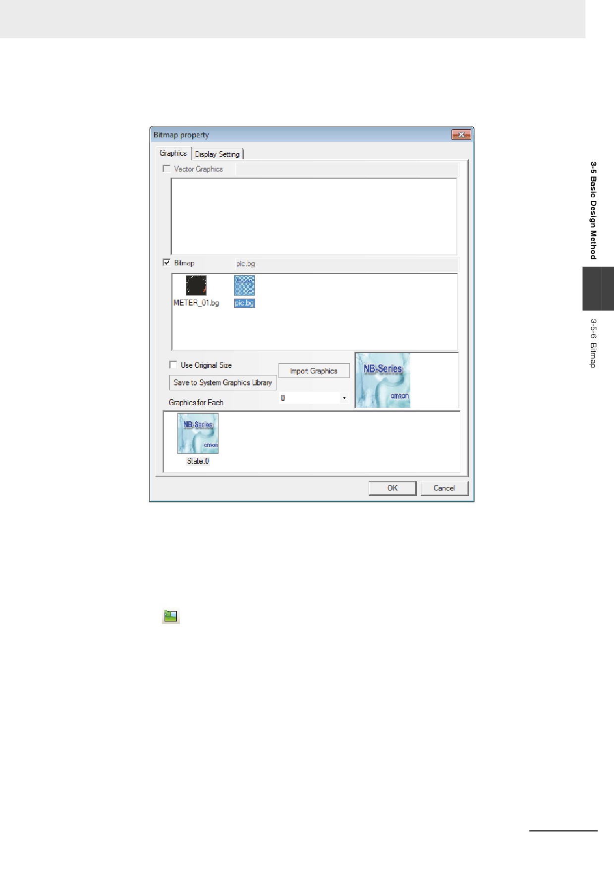
z Use of Bitmap
1
Double-click the component where the bitmap will be used and then enter “Graphics” tab.
3
2
Check “Bitmap” option, and select the bitmap you want to use, then click “OK” button to close
the dialog box.
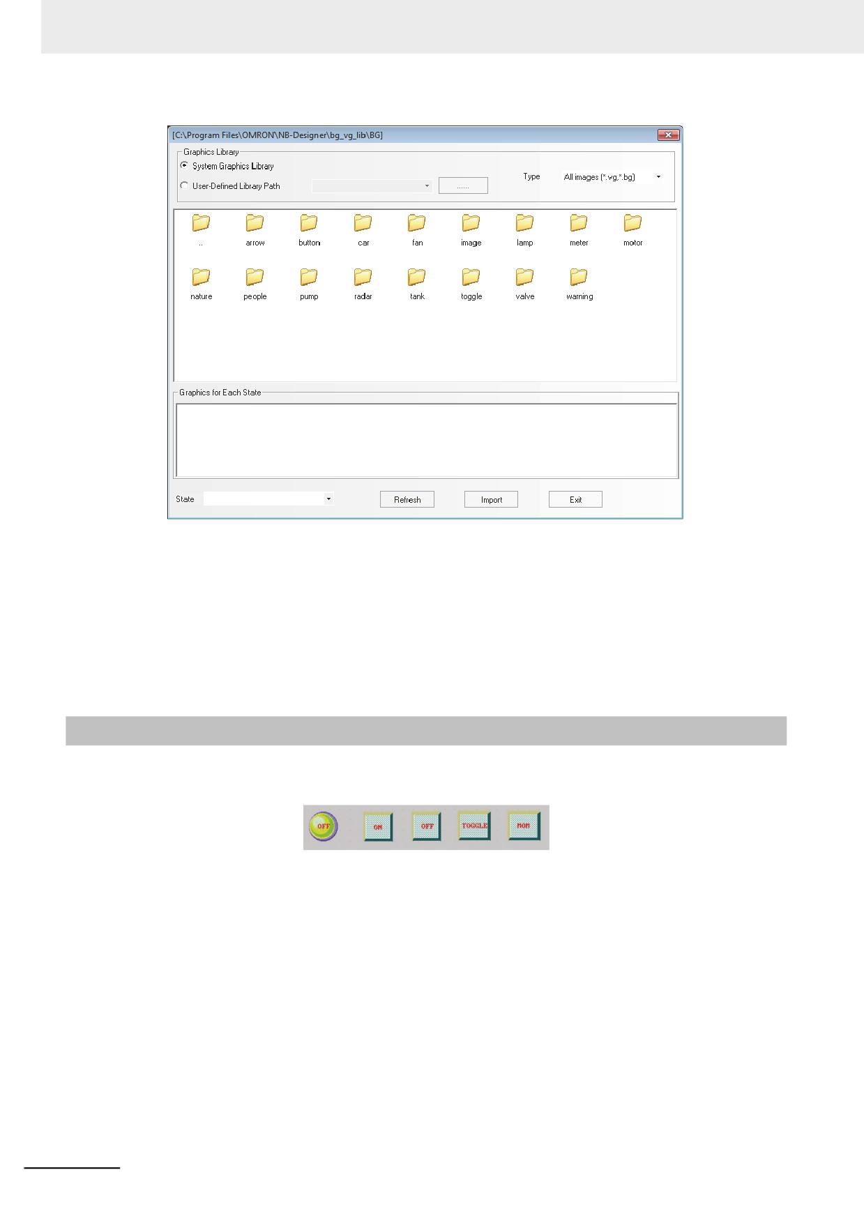
z Import of Bitmap
1
You can import the bitmap just like importing the Vector Graphics. Click “Import Graphics”
icon
, and select “Bitmap image (*.bg)” in the “Type” in the pop-up dialog box. You can
also import the bitmap used in the other project or the System Graphics Library. The system
graphics library is located in bg_vg_lib\VG directory in which the NB-Designer was installed
and all the graphics are stored in the folders for each item.
3-67
3 Functions of NB-Designer
2
In the same project, the bitmap and the Vector Graphics are placed in the same location, i.e.
“VG” folder under “Project File” folder. And all the imported bitmaps are stored in
“project\<project file name>\image” folder. Don’t delete these pictures; otherwise the graphics
library will not be displayed normally.
Note There is no limitations for the size of the graphics imported (BMP, JPG, GIF, PNG), and the graphics will be
compressed according to the maximum used size (The maximum used size = Maximum length × Maximum
Width in the project) during the compilation.
3-5-7
Creating Label
Label refers to the text displayed in the surface of the components such as switch, lamp or the other
components.
z Label Addition
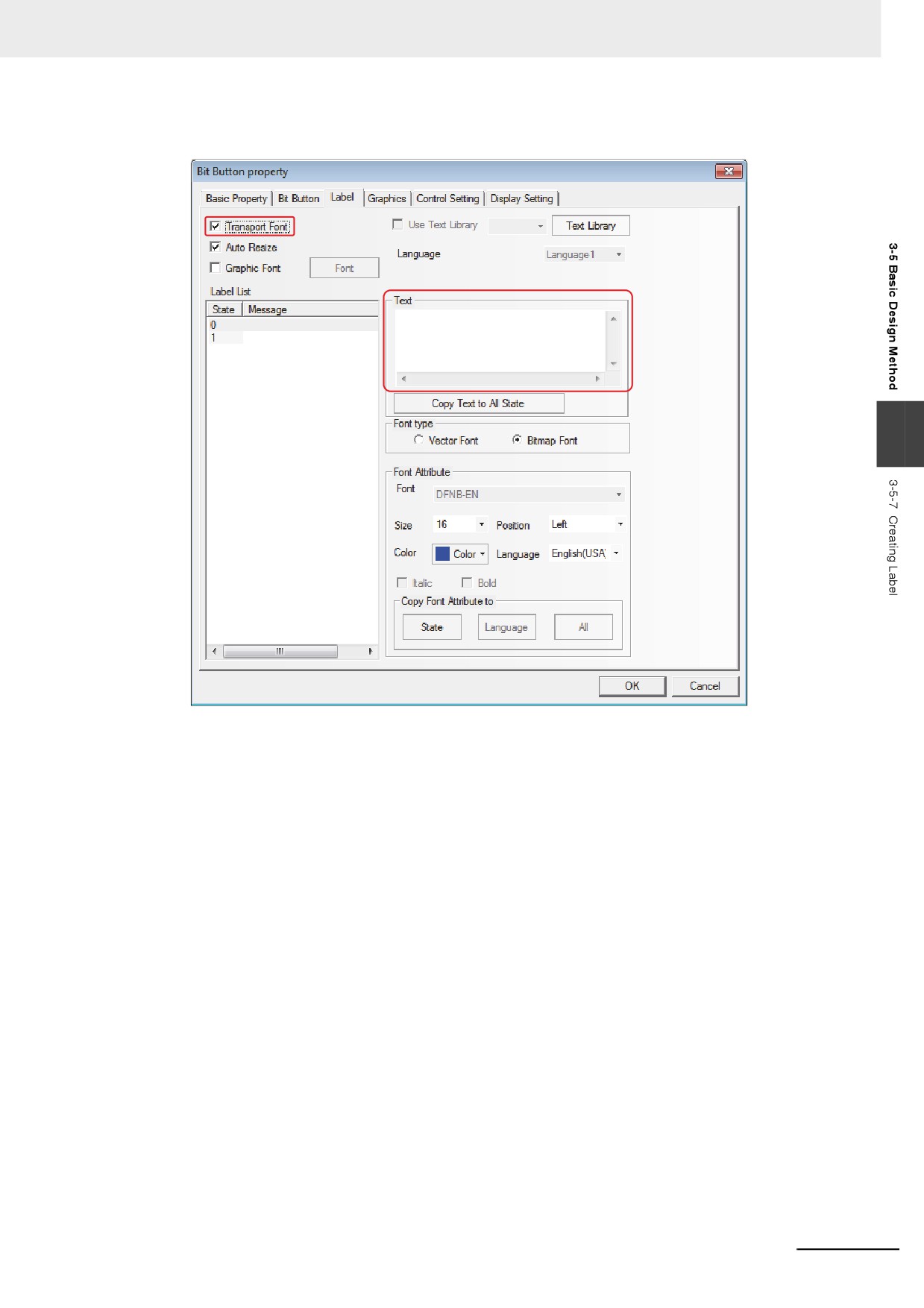
1
Select [Label] in the Property page of the selected component.
2
Check “Transport Font”.
3-68
3 Functions of NB-Designer
3
As shown below, write the contents to be displayed for the label in [Message].
3
4
Set the display Properties such as the alignment method, font size and color etc.
5
Press the [OK] button to complete the setup.
z State Number
State number is only effective for the component with multiple states. The text for every state can be
displayed independently. The text, font, color and alignment method for the corresponding state can
be set after the state is selected.
z Message
Input the text to be displayed in the component surface here. If there are several lines, you can use
“Enter” key to break them.
z Font Size
The size of Bitmap Font is as follows: 8, 16, 24, 32, 48, 64, 72, 96, 120 and 144 pixels.
z Position
When the input text for the label is 2 lines or more, Left, Right or Center can be selected for the
alignment between the upper line and the lower line.
3-69
3 Functions of NB-Designer
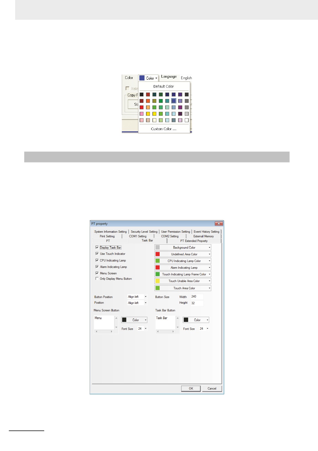
z Color
You can select color among 40 colors (65536 colors, which include supplementary colors). “Default
Color” palette contains the most commonly-used colors. “Custom Color…” palette allows the users
to customize the palette (65536 kinds of colors available).
3-5-8
Task Bar and Operation Buttons
NB-Designer provides a simple method (i.e. the Task Bar) to make the screen pop up or be minimized,
to change the display of the screen and fast switch the screen display etc.
Task Bar has 2 operation buttons, one of which is used to control the Menu Screen, and the other is
used to control the Task Bar.
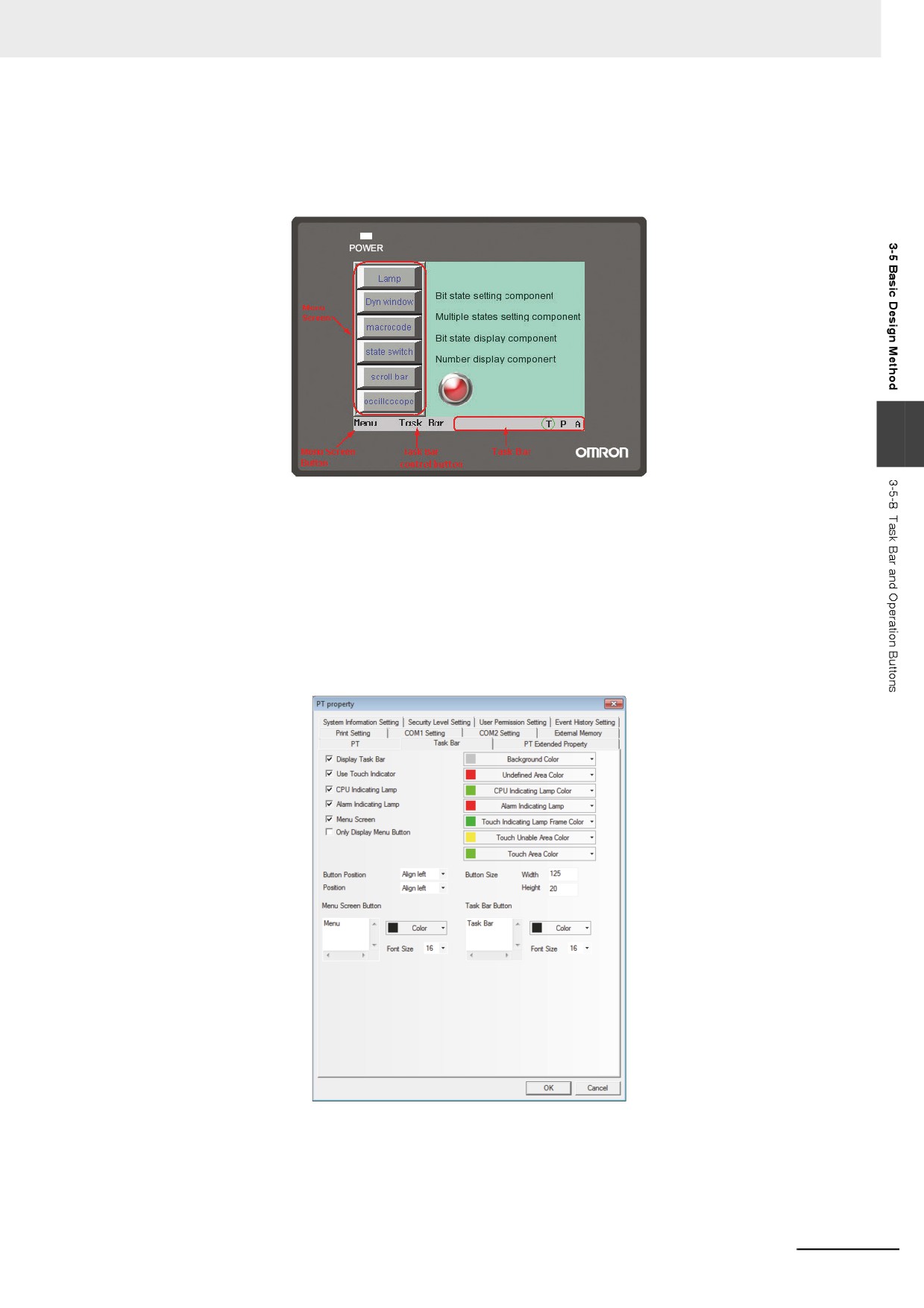
You can set the Properties such as the Task Bar, whether to use the Menu Screen, color and position
and so on in the [PT Property] in the Configuration and Setup Window. (By default, all the options in the
Display Task Bar are checked.)
3-70
3 Functions of NB-Designer
If “Menu Screen” is checked, one Menu Screen will pop up when the Menu Screen button at the left
side is pressed. Function keys put in the Menu Screen allow the different screen switched. Because the
Menu Screen is always displayed on all of the screens, therefore it can be operated at any time. If you
want to switch to a certain screen, it just needs to press the function key pointing to the destination
screen once, thus avoiding the boring process of looking for the screen.
3
In the task bar, 16 icons can be arranged at the same time. The functions keys of [Minimize] or [Title
Bar in Pop-up Screen] included in Pop-up Screen allow the screens to minimize in the task bar. For
details, refer to 3-7-2 Function Key (Page 3-201).
z Process of Operation Button Setup
Double click PT in the Configuration and Setup Window. Then the PT Property dialog box will appear,
and set [Display Task Bar], whether the operation button will locate in the left side or right side of the
screen, the background color and the text position method of the taskbar in [Task Bar] tab. If the label
isn’t displayed completely, you can adjust the width or the height of the button area and the font size of
the label to solve this problem.
Note The Menu Screen is displayed on the left side or the right side of the panel during the operation. In edit
window state, the Menu Screen is an independent screen, and it is Frame 2 by default. For details, refer to 3-
10-2 Task Bar (Page 3-292).
3-71
3 Functions of NB-Designer
3-5-9
Fonts
z Type and Characteristics of Font
NB-Designer provides 3 available fonts, i.e. Bitmap Font, graphic font and vector font. The
characteristics of these three fonts will be described as follows:
Bitmap Font :
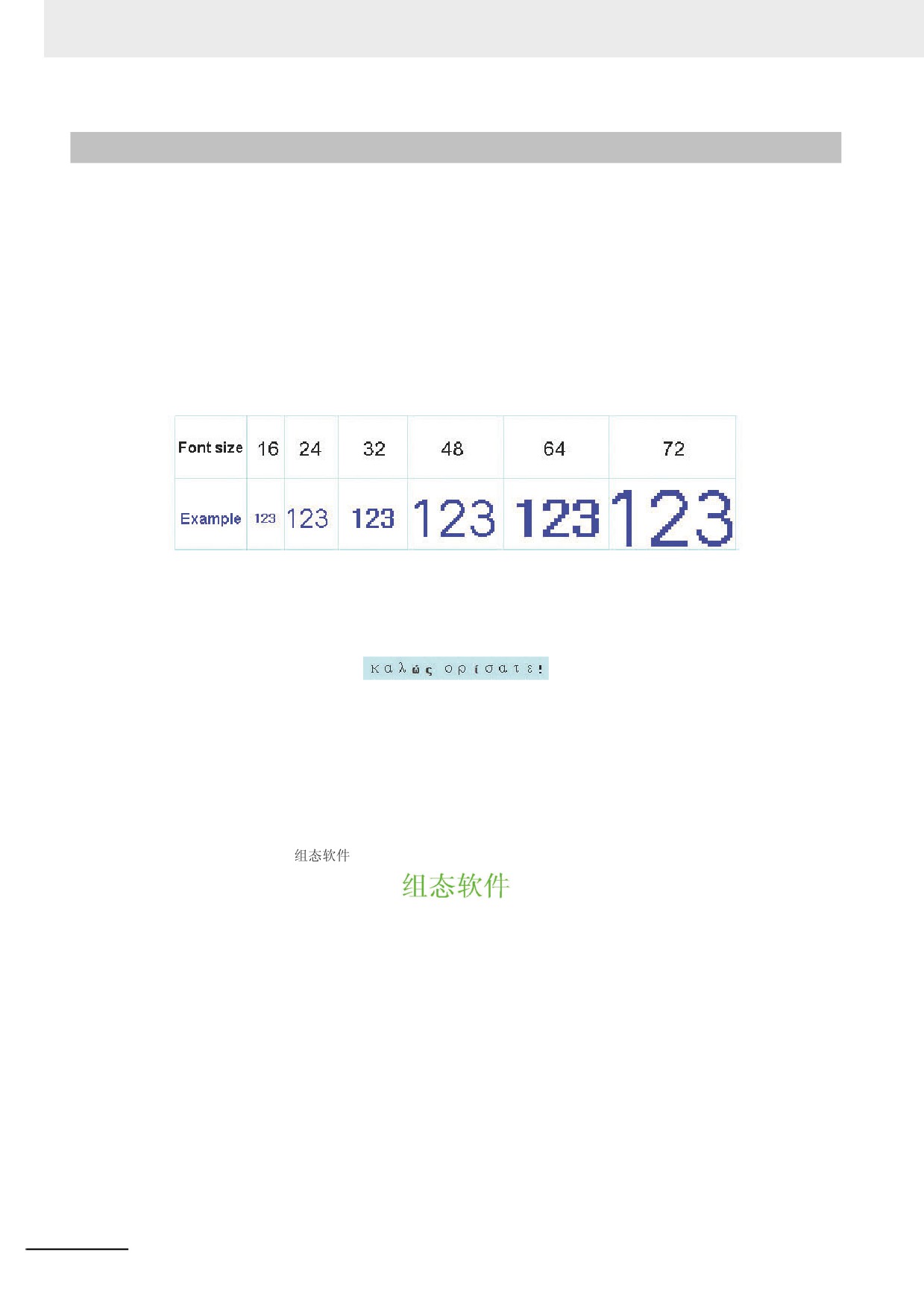
One bitmap font is prepared for each character. But this method has obvious disadvantages:
(a) Only SimSun is supported.
(b) The scaling effect is poor. For each character, 3 kinds of bitmaps (i.e. 8×8, 16×8, 24×16(height ×
width)) are reserved respectively, so the effect is very poor when the larger font is displayed, as
shown below:
(c) Single-byte character may be treated as double-byte character. ASCII code is treated as a single-
byte character, but the other character are converted to double-byte character in the software.
Therefore, a character varies in its width for each character (such as Russian) cannot be displayed
correctly.
Therefore, this method has the obvious disadvantages for the project with multiple languages.
Graphic Font:
Graphic font is converted to one bitmap and stored in the project. This method can make full use of the
fonts installed in Windows and the display effect is good.
(a) The capacity of the project becomes greater. There are 2 reasons for the large space needed for
saving the character string as bitmap. First, bitmap format itself needs a large space. For example:
Four characters “
” displayed in Zero SimSun needs 1824 bytes, as shown below:
In addition, the bitmap font should be intercepted again if the content, size or colors vary slightly,
thus causing a linear increase in the occupied space.
When a character is converted as a bitmap, it is converted as the unit of character string, not the
unit of the character. Even if a similar character is different with its content, font size, color, the
character is converted as an individual bitmap. As the converted bitmaps are stored in the NB
project file for each character string with different properties as above, the capacity occupied with
the fonts should be increased in the project.
(b) Text library or some component labels do not support the graphic font.
Vector Font:
The characters used for labels or supposed to be used in future are abstracted through specified fonts
by NB-Designer. Only the abstracted characters are stored as True Type font (ttf style) and can be
used by the NB-Designer units.
Using vector font in NB-Designer can avoid the disadvantages of Bitmap Font and graphic font.
Vector font has the following advantages:
3-72
3 Functions of NB-Designer
(a) It supports a large variety of vector fonts. The TrueType font (only the font in ttf format) installed in
the operating system can be used.
(b) You can save the capacity of project file. It adopts the method of intercepting the matrix from the
font file, thus reducing the capacity of the font file. For the same character in the same font, only
one matrix needs to be intercepted regardless of the size, color, bold/italic styles.
(c) Rich font styles are available. Bold and italic styles are available for each kind of font.
(d) The font size can be set freely without any deformation. You can set the consecutive font sizes
without any projections.
(e) It supports powerful multiple languages. You can use it to set fonts for each state and each kind of
language of the text.
(f) The vector font can be used in the text library.
z Use of Vector Font
The functions and components related to the vector font are as follows:
3
1
Text Library
Using the text library can realize the reuse of the text and the multi-language project.
The operation instructions related to the font:
(a)
Maximum language number setup
The maximum language number can be set up to 32. If smaller capacity of project file is preferable,
set the maximum language number to the least necessary number.
(b)
Default font setup for each language
The user can set the default font for each language, and when the user uses the text library, he
doesn’t need to reselect the font each time.
2
Text Component
Text component can display the character information statically. And the user can use the multi-
language text when the text library is used.
(a)
The text component can use 3 kinds of fonts, i.e. Bitmap Font , graphic font and vector font.
(b)
In the text library mode, the text component can reset the font for each language by changing the
language displayed currently.
3
Label
Most of the components can use the label. The text string can be directly input and the text library
can also be used in the component label.
(a)
When the text library isn’t used, different fonts can be set for text string in each state.
(b)
When the text library is used, fonts can be set for the text string of each language and in each
state.
4
Component dealing with numbers
Number components include number input component and number display component.
After the vector font is set for the number input component, the content of the number input
component will be displayed as vector font to realize the better display effect.
5
Component dealing with text strings
Text components include text string input component, text display component and note book
component.
3-73
3 Functions of NB-Designer
(a) Limitations to ASCII codes for the vector font: The text contents used for the component dealing
with text string often can’t be decided during the compilation of the project, and due to the
limitations to the storage capacity, all the characters that may be used can’t be downloaded to the
PT. Therefore, these components can only use ASCII characters (The matrix information
supporting all the ASCII characters for this font have been downloaded to the PT by the software.)
when using the vector font.
(b) Unicode character encoding. When the Bitmap Font and the Unicode are selected simultaneously,
you can use the function key to input Unicode character to the text input component.
6 Time Component
Time component can display the information such as year, month, day, hour, minute, second and
week etc. of the current system in the simplest way.
When the vector font is selected, the time will be displayed according to the set vector font.
7 List and Drop-down List
List and drop-down list options are available for selection in the Word Switch component, and in
such state, the label for the component is listed as the list. Similarly, fonts can be set for each
language and each state.
8 Alarm and Event Information
Alarm and event information component can also set different vector fonts for each piece of alarm
information and for each language (When the text library is used.) respectively.
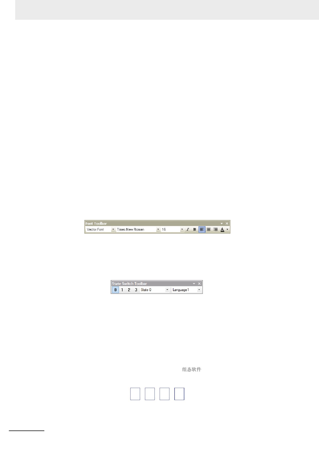
z
Use of Font Toolbar
The software provides the toolbar for convenient font operation. When you select one or more
components, you can use the font toolbar to change the font Properties of the related components.
Please pay attention to the following conditions:
(a) The font attributes set through the toolbar for the current state and current language. If the
attributes of other states and languages need to be changed, you can do it through the component
dialog box or by changing the current state or the current language of the project, as shown below:
(b) When multiple components are selected, if the component doesn’t support a certain font attribute,
the attribute of this component will not be affected by using the font toolbar to set the font attribute.
z Notes for Using Vector Font
Based on the special realizing method for the vector font, the following conditions should be paid
attention to when the vector font is used:
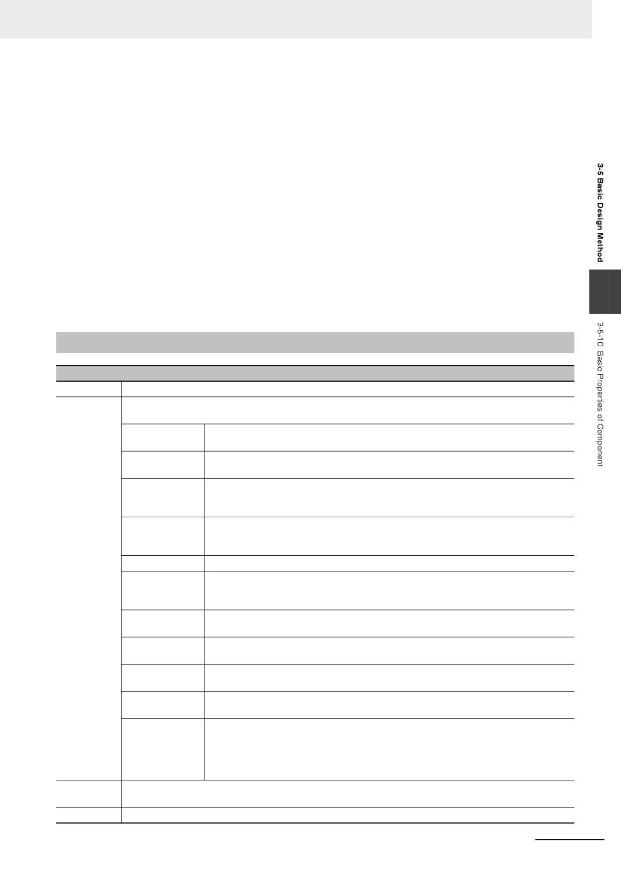
1 If the font which is not supported for text to be displayed is used, the font cannot be displayed
correctly.
For example, if you want to display four characters “
” using Arial font, but because these
four characters are not included in the Arial character set, so four square boxes will be displayed in
this case, as shown below. Therefore, you must select the fonts supporting text to be displayed.
3-74
3 Functions of NB-Designer
2 Use the vector font as much as possible if the smaller capacity of project file is preferable.
Because the Bitmap Font and graphic font have many disadvantages in the storage space and
resizing etc, therefore, use the vector font as much as possible.
3 The types of the vector font can be reduced when the screen can meet the requirements.
If too many types of vector fonts (e.g. dozens or more) are used by the user, the number of font
files will be too many, thus affecting the compilation speed, downloading speed and screen
switching speed.
4 Install the same fonts for all the PC environments to edit text strings.
If a certain project uses “Microsoft Elegant Black” font when it is edited on PC, and when it is
transferred to another PC where no “Microsoft Elegant Black” font exists for editing, then all the
“Microsoft Elegant Black” characters used in the project will be changed to arbitrary font which is
decided as optimal by the operation system.
3
Note When the font installed with Windows is used, use it only after confirming the font will not give rise to
problems under the Copyright Law.
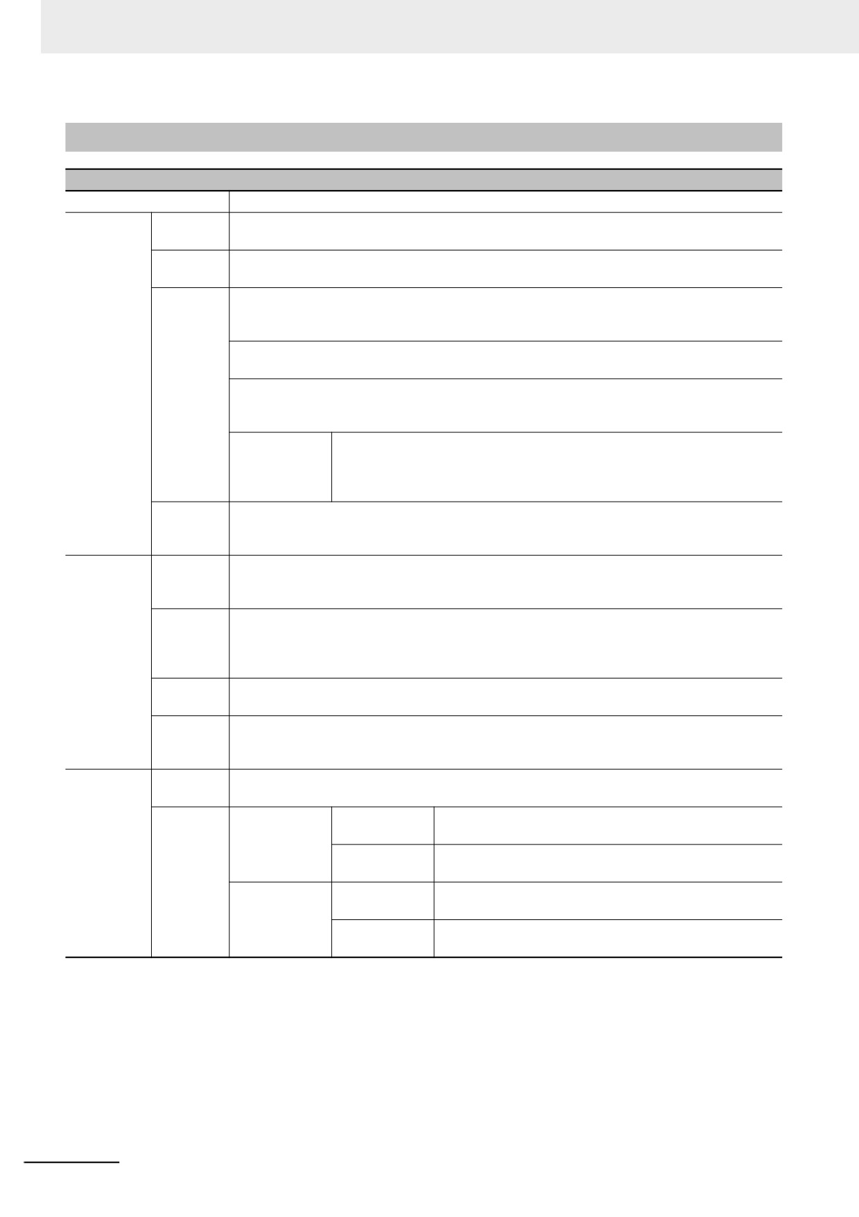
3-5-10
Basic Properties of Component
Basic Properties of Component
Priority
It is pre-reserved for the function.
Write
If the component supports read only, you cannot set to writing addresses. The status of the components will
Address
be displayed based on the reading addresses.
PT
Number of the controlled PT. The numbers are allocated automatically when the PT is
placed on [Configuration and Setup Window].
PLC No.
Number of the controlled PLC. The numbers are allocated automatically when the PLC
is placed on [Configuration and Setup Window].
Change Station
This option can be used to access the specific PLC during the communication with
Number
multiple PLCs. This option is applicable when editing only one PLC in the case one PT
is connected with multiple devices or multiple PTs are connected with multiple devices.
Area/Variable
Refers to the memory of PLC device to be controlled or the internal memory of the PT.
For the internal address type of PT, refer to 3-5-4 Read/Write Address for PLC (Page 3-
59).
Address
Specifies address to be written to.
Data Format
The code type includes BIN, BCD, and LSB. When BIN or BCD code is used, it allows
to display 256 of statuses at maximum and when LSB code is used, it allows to display
17 of statuses at maximum. (Refer to 10 LSB Type (Page 3-379) in the section 3-16).
Word Length
Refers to the number of the occupied memories. The default number is 1, and it varies
with the different component or area/variable.
System memory
Refers to the internal memories provided by the PT for some special purposes. For
details, refer to 3-11 Address of System Memory (Page 3-328).
Format (Range)
Refers to the formats of the address types of the PLC memories or the internal memory
address of the PT.
Use Variable
Determines whether to use the addresses registered in the variables. For details, refer
to 3-8-2 Variable Table (Page 3-244).
Use the index
Determines whether to use the specified memory as the index memory for the control
memory
memory of the current component. The new [Read/Write Address] = the specified
[Read/Write Address] + [Index Address]. For example, when the specified written
address is D100 and the index memory address is LW0, if LW0=10, the new write
address is D100+10=D110.
Read
If the component supports write only, you cannot set to reading addresses. The status of the components
Address
will be displayed based on the writing addresses.
Description
Refers to the reference name assigned to the current component (not displayed).
3-75
3 Functions of NB-Designer
3-5-11
Control Setting of Component
Control Setting of Component
Option
Descriptions
Touch
Enable
Checking this option means the state value can be written into the controller by triggering the
Enabling
Input
effective area for the current component.
Setting
Disable
Checking this option means the state value cannot be written into the controller even when
Input
triggering the effective touching area for the current component.
Conditional
Security Level: Checking this option means only when the security level of the operator is
Enabling
higher than the minimum security level already set, the current component can be touched,
and the state value can be written into the controller.
User Permission Control: Checking this option means the operator must have the permission
to touch the current component and write the state value into the controller.
Indirect reference: Checking this option means only when the state of the specified bit memory
or word memory meets the set conditions, the current component can be touched, and the
state value can be written into the controller.
Auto show
Checking this option means the Password Input Screen Frame 9 (Login
login screen
screen) will pop up automatically for the user to login when the security level
or the permission of the current user doesn’t meet the requirement of the set
level or authority.
Show
Checking this option allows Unable-to-Input figure will be displayed when the component is in
Unable-to-
invalid to input. This function is optional only when [Enable Input] or [Conditional Enabling] is
Input
checked; and touching invalid color can be set in [PT Property]-[PT Extended Properties].
Security
ON Delay
When the current component is pressed consecutively for this set time, the state value can be
Setting
written only to the controller. The minimum unit is 100 ms. When this option is 0, this function is
invalid.
Confirm
Checking this option means the Confirmation Screen will pop up automatically when the
Operation
current component is touched, and the state value can be written into the controller when
“YES” is clicked, while the operation will be cancelled automatically when the user have clicked
“Cancel” or haven’t confirmed “YES” after the set “wait[s]” is exceeded.
Operation
Checking this option means the operation event will be recorded, and displayed through the
Log
operation log element and the file in CSV format will be saved into the external memory.
Min Inteval
Refers to the minimum interval between 2 operations for the same component or different
components. The minimum unit is second. When this option is 0, the minimum interval is
invalid.
Triggering
Macro
Checking this check box allows the macro which was specified before the current operation
action
was completed will be triggered and executed. *
Write
Word
Notice Before
Writes the write-value into the specified address before the
Notice
Written
current operation is performed successfully.
Notice After
Writes the write-value into the specified address after the
Written
current operation is performed successfully.
Bit
Notice Before
Writes ON/OFF signal into the specified address before
Written
the current operation is performed successfully.
Notice After
Writes ON/OFF signal into the specified address after the
Written
current operation is performed successfully.
* Please refer to 3-9-3 Macro Triggering (Page 3-273).
3-76
3 Functions of NB-Designer
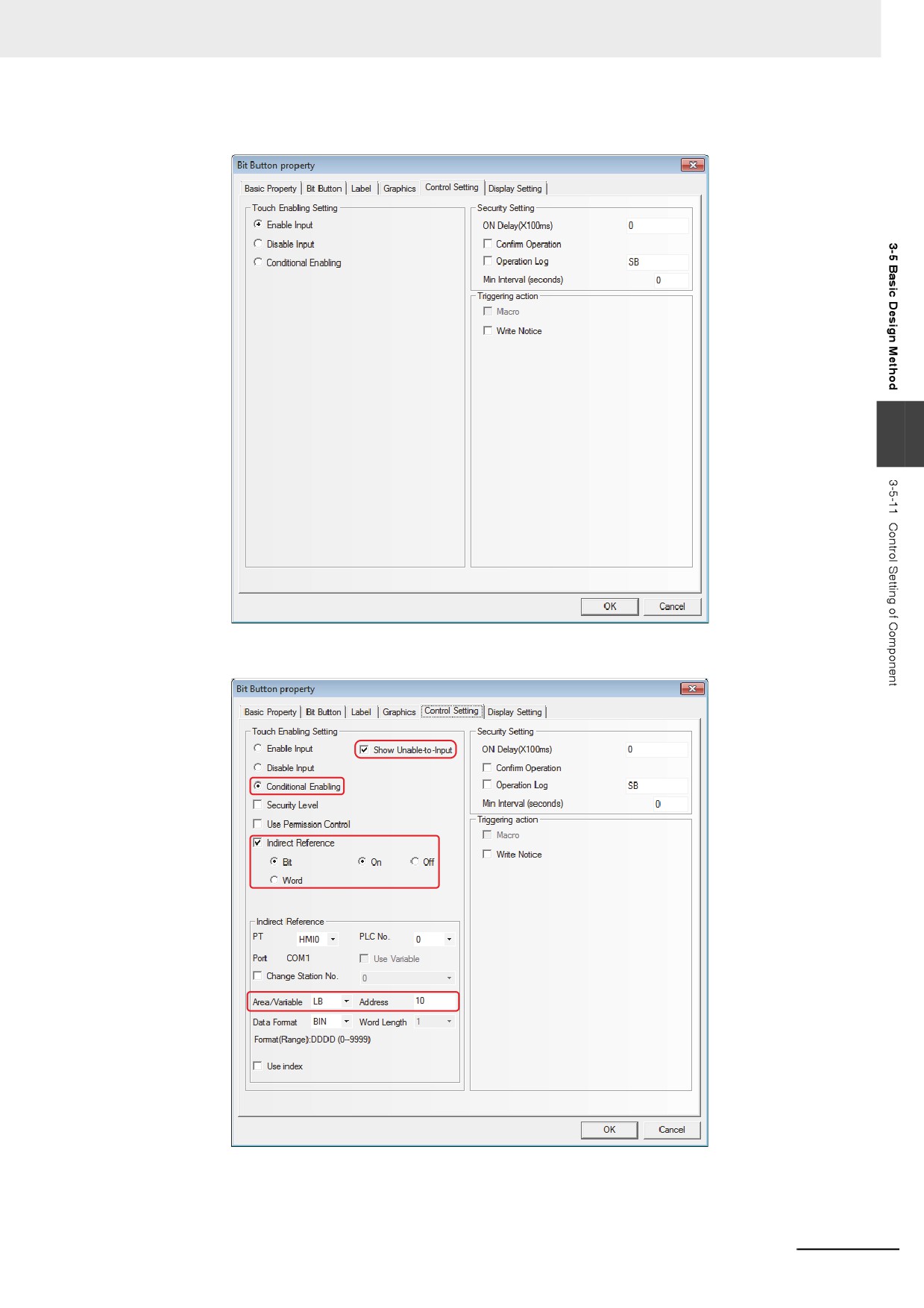
z Example of Control Setting
3
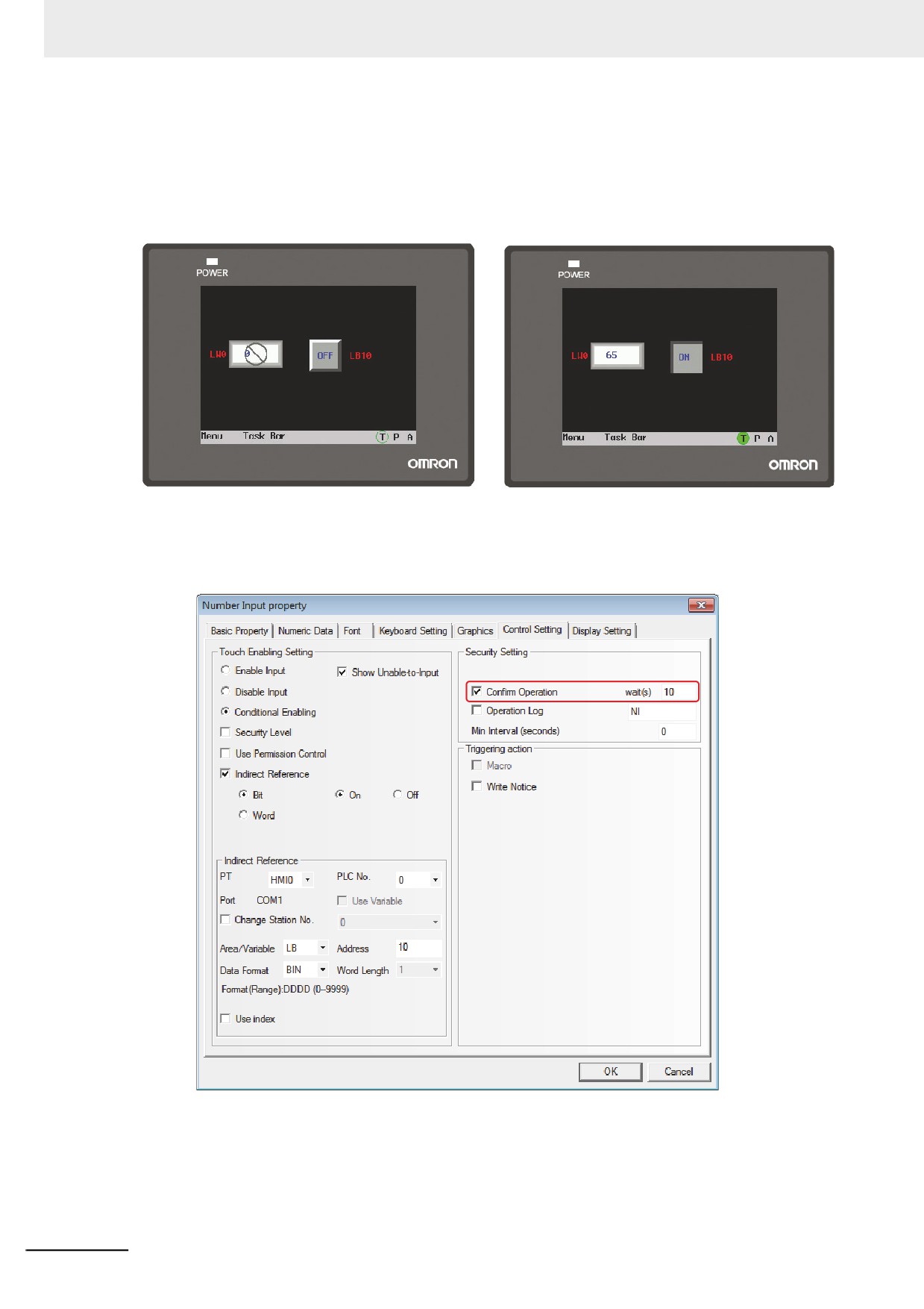
Example: Setting the parameters as below to enable the value input to LW0 when LB10 is ON.
3-77
3 Functions of NB-Designer
1 Perform the offline test. When LB10 is OFF, the input by the number input component is invalid,
and the icon indicating [Unable-to-Input] is displayed, as shown in the following left graphics.
2 When LB10 is ON, the input by the number input component is valid, and the icon indicating
[Unable-to-Input] isn’t displayed as shown in the following right graphics.
z Example of Security Setting
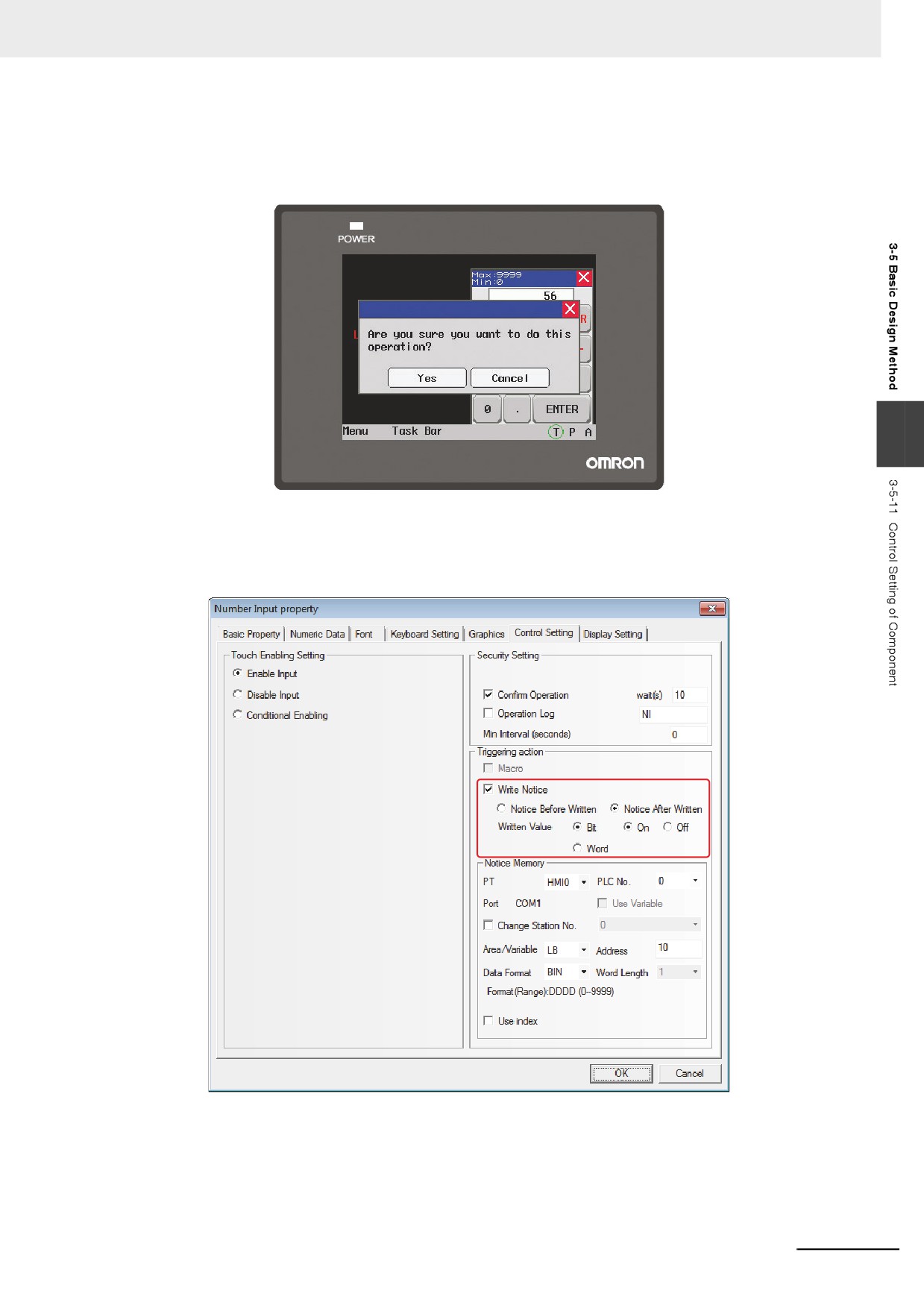
Example: Set LW0 to the address of number input component, check Operator Comfirm, and select
10 s for “wait[s]”.
3-78
3 Functions of NB-Designer
Perform the offline test. Operate the number input component, and the Confirm Screen will pop up
during the confirmation operation. In this case, press “Yes” to input the data successfully, press
“Cancel” to cancel the input. If 10 seconds pass without pressing “Yes” nor “Cancel”, the
Confirmation Screen will disappear automatically.
3
z Example of Notifications
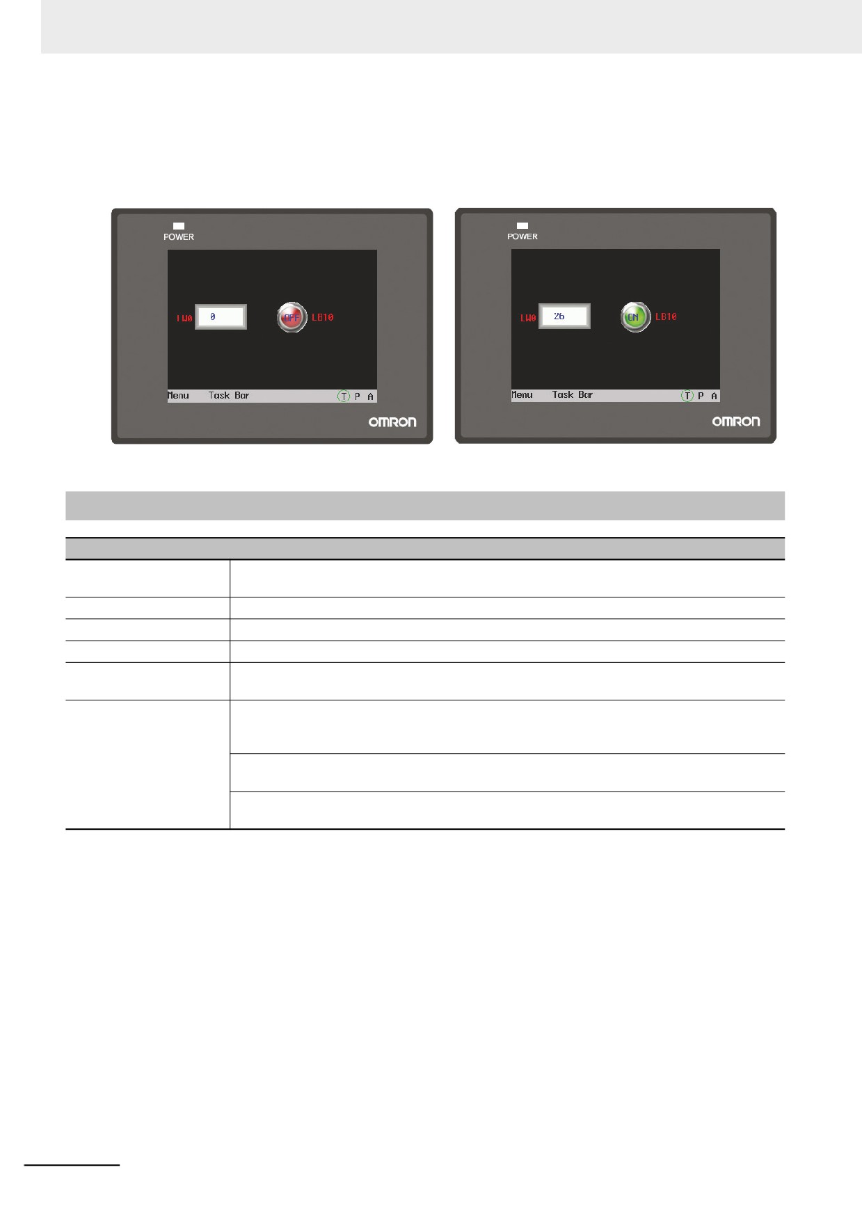
Example: Set LW0 to the address of number input component. Set After Written Notice as LB10 is
ON after writing the address.
3-79
3 Functions of NB-Designer
Perform the offline test. And when no data is written into the number input component LW0, LB10 is
“Off”, as shown in the following left graphics.
When the data is written into the number input component, LB10 is “On”, as shown in the following
right graphics.
3-5-12
Display Setting of Component
Display Setting for Component
Lock Position
Checking this option means the component is locked. Once the component is locked, it can’t
be moved by the mouse or the moving keys in the keyboard.
X/Y
Refers to the coordinate value of the vertex in the upper-left of the component.
Width/Height
Refers to the width and height of the component (The unit is pixel point).
Display
Checking this option means the current component is always in displayed state.
Not Display
Checking this option means the current component is always in “hide state” and the touching is
[Touching is invalid]
invalid when the component is hidden.
Conditional Display
Security Level Control: Checking this option means the current component can be displayed
only when the security level of the operator is higher than the minimum security level already
set.
User Permission Control: Checking this option means the current component can be displayed
only when the operator has the set permission.
Indirect Reference: Checking this option means the current component can be displayed only
when the state of the specified bit memory or word memory meets the set conditions.
3-80
3 Functions of NB-Designer
z Example of Display Setting
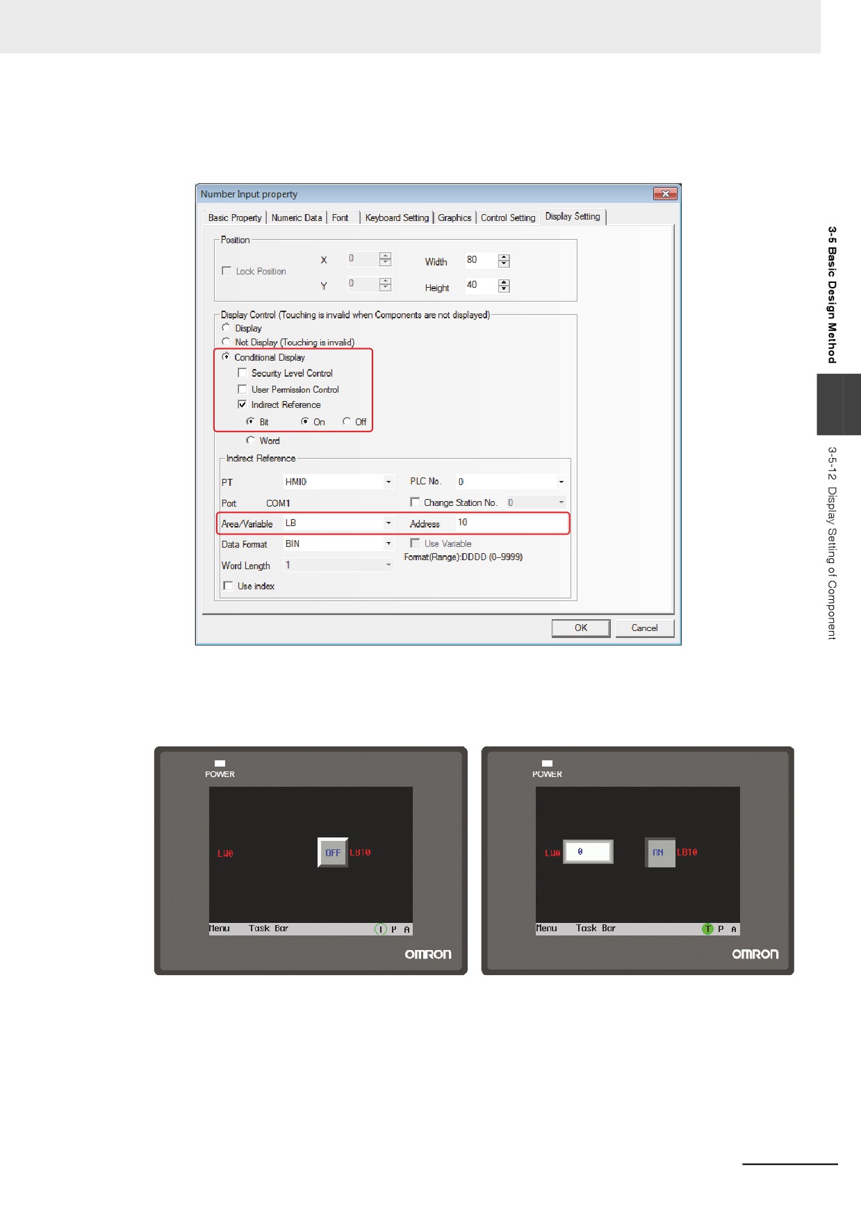
Example: Set LW0 to the address of number input component make display setting and keep LB10 as
“On”.
3
Perform the offline test. When LB10 is Off, the number input component is hidden, as shown in the
following left graphics.
When LB10 is On, the number input component is displayed, as shown in the following right
graphics.
3-81
3 Functions of NB-Designer
3-6
Parts
Parts are designed to meet specific needs. Generally speaking, one component can realize one
function, but some components should be combined with the related components or PLC to realize
some specific functions, as shown below.
Components
Related Components
Descriptions
Number Input
Function Key
To create the keyboard by “Function Key”
Text Input
Function Key
To create the keyboard by “Function Key”
Indirect Screen
Screen
The created “screen”
Direct Screen
Screen
The created “screen”
Alarm Setting
Alarm, Alarm Display
To display the registered alarm information by “Alarm”
or “Alarm Display”
Alarm
Alarm Setting
To display the alarm information registered by “Alarm
Setting” component
Alarm Display
Alarm Setting
To display the alarm information registered by “Alarm
Setting” component
Event Setting
Event
To display the registered event by “Event” component
Event
Event Setting
To display the event registered by “Event Setting”
component
PLC Control
PLC
To make PLC program control the operations of the
functions
Most of the PLC part support “bit” or “word” addresses (“Double-word” operation can be performed by
some components such as Number Input and Scroll Bar etc. Due to some PLCs have “double-word”
addresses, so some PLC drivers will make conversion between “double-word” and “word”, and the user
must pay special attentions to the instructions of PLC driver.
3-6-1
Bit Button
Bit Button component defines one touching area. When this area is activated, the bit
address inside the PT or in the PLC can be switched to “On” or “Off” forcefully.
3-82