SINUMERIK 840D sl. Basesoftware and operating software. Manual (2019) - page 11
Generating user dialogs
1.10 Predefined functions
Function name
Description
Control local time
The function copies the local time in a field with 7 array elements.
The name of the variable is expected as call parameter.
The following is stored in an array element:
● Index 0 - year
● Index 1 - month
● Index 2 - weekday
● Index 3 - day
● Index 4 - hour
● Index 5 - minute
● Index 6 - second
Syntax:
<function name ="control.localtime">_T"time_array"
</function>
Example:
<!-- index
0 = Year
1 = Month
2 = Day of week
3 = Day
4 = Hour
5 = Minute
6 = Second
-->
<let name="time_array" dim="7" />
<function name ="control.localtime">_T"time_array"
</function>
Easy XML
130
Programming Manual, 12/2019, 6FC5397-1DP40-6BA3
Generating user dialogs
1.10 Predefined functions
Function name
Description
String to compare
Two strings are compared with one another from a lexicographical per-
spective.
The function gives a return value of zero if the strings are the same, a
value less than zero if the first string is smaller than the second string or
a value greater than zero if the second string is smaller then the first
string.
Parameter:
str1 - string
str2 - comparison string
Syntax:
<function name="string.cmp" return ="<int var>" >
str1, str2 </function>
Example:
<let name="rval">0</let>
<let name="str1" type="string">A brown bear hunts a
brown dog.</let>
<let name="str2" type="string">A brown bear hunts a
brown dog.</let>
<function name="string.cmp" return="rval"> str1,
str2 </function>
Result:
rval= 0
Easy XML
Programming Manual, 12/2019, 6FC5397-1DP40-6BA3
131

Generating user dialogs
1.10 Predefined functions
Function name
Description
String to compare without making a distinction be-
Two strings are compared from a lexicographical perspective (the com-
tween uppercase/lowercase
parison is not case-sensitive).
The function gives a return value of zero if the strings are the same, a
value less than zero if the first string is smaller than the second string or
a value greater than zero if the second string is smaller then the first
string.
Parameter:
str1 - string
str2 - comparison string
Syntax:
<function name="string.icmp" return ="<int var>" >
str1, str2 </function>
Example:
<let name="rval">0</let>
<let name="str1" type="string">A brown bear hunts a
brown dog.</let>
<let name="str2" type="string">A brown Bear hunts a
brown Dog.</let>
<function name="string.icmp" return="rval"> str1,
str2 </function>
Result:
rval= 0
String left
The function extracts the first nCount character from string 1 and copies
this to the return variable.
Parameter:
str1 - string
nCount - number of characters
Syntax:
<function name="string.left" return="<result
string>"> str1, nCount </function>
Example:
<let name="str1" type="string">A brown bear hunts a
brown dog.</let>
<let name="str2" type="string"></let>
<function name="string.left" return="str2"> str1,
12 </function>
Result:
str2="A brown bear"
Easy XML
132
Programming Manual, 12/2019, 6FC5397-1DP40-6BA3

Generating user dialogs
1.10 Predefined functions
Function name
Description
String right
The function extracts the last nCount character from string 1 and copies
this to the return variable.
Parameter:
str1 - string
nCount - number of characters
Syntax:
<function name="string.right" return="<result
string>"> str1, nCount </function>
Example:
<let name="str1" type="string">A brown bear hunts a
brown dog.</let>
<let name="str2" type="string"></let
<function name="string.right" return="str2"> str1,
10 </function>
Result:
str2="brown dog."
String middle
The function extracts the specified number of characters from string 1,
starting from the iFirst index, and copies these to the return variable.
Parameter:
str1 - string
iFirst - start index
nCount - number of characters
Syntax:
<function name="string.middle" return="<result
string>"> str1, iFirst, nCount </function>
Example:
<let name="str1" type="string">A brown bear hunts a
brown dog.</let>
<let name="str2" type="string"></let
<function name="string.middle" return="str2"> str1,
2, 5 </function>
Result:
str2="brown"
Easy XML
Programming Manual, 12/2019, 6FC5397-1DP40-6BA3
133

Generating user dialogs
1.10 Predefined functions
Function name
Description
String length
The function gives the number of characters in a string.
Parameter:
str1 - string
Syntax:
<function name="string.length" return="<int var>">
str1 </function>
Example:
<let name="length">0</let>
<let name="str1" type="string">A brown bear hunts a
brown dog.</let>
<function name="string.length" return="length">
str1 </function>
Result:
length = 31
Strings to replace
The function replaces all the substrings found with the new string.
Parameter:
string - string variable
find string - string to be replaced
new string - new string
Syntax:
<function name="string.replace"> string, find
string, new string </function>
Example:
<let name="str1" type="string">A brown bear hunts a
brown dog. </let>
<function name="string.replace" > str1, _T"a brown
dog" , _T"a big salmon"</function>
Result:
str1 = "A brown bear hunts a big salmon!"
Easy XML
134
Programming Manual, 12/2019, 6FC5397-1DP40-6BA3

Generating user dialogs
1.10 Predefined functions
Function name
Description
Strings to remove
The function removes all the substrings found.
Parameter:
string - string variable
remove string - substring to be deleted
Syntax:
<function name="string.remove"> string, remove
string </function>
Example:
<let name="index">0</let>
<let name="str1" type="string">A brown bear hunts a
brown dog. </let>
<function name="string.remove" > str1, _T"a brown
dog" </function>
Result:
str1 = "A brown bear hunts"
Strings to insert
The function inserts a string at the index specified.
Parameter:
string - string variable
index - index (zero based)
insert string - string to be inserted
Syntax:
<function name="string.insert"> string, index,
insert string </function>
Example:
<let name="str1" type="string">A brown bear hunts.
</let>
<let name="str2" type="string">a brown dog</let>
<function name="string.insert" > str1, 19, str2
</function>
Result:
str1 = "A brown bear hunts a brown dog"
Easy XML
Programming Manual, 12/2019, 6FC5397-1DP40-6BA3
135
Generating user dialogs
1.10 Predefined functions
Function name
Description
String delete
The function deletes the defined number of characters starting from the
start position specified.
Parameter:
string - string variable
start index - start index (zero based)
nCount - number of characters to be deleted
Syntax:
<function name="string.delete"> string, start
index , nCount </function>
Example:
<let name="str1" type="string">A brown bear hunts.
</let>
<function name="string.delete" > str1, 2, 5
</function>
Result:
str1 = "A bear hunts"
Easy XML
136
Programming Manual, 12/2019, 6FC5397-1DP40-6BA3
Generating user dialogs
1.10 Predefined functions
Function name
Description
String find
The function searches the transferred string for the first match with the
substring.
If the substring is found, the function provides the index to the first char-
acter (starting with zero) or, failing this, -1.
Parameter:
string - string variable
findstring - string to be found
startindex - start index (optional)
Syntax:
<function name="string.find" return="<int val>">
str1, find string
</function>
Example:
<let name="index">0</let>
<let name="str1" type="string">A brown bear hunts a
brown dog. </let>
<function name="string.find" return="index"> str1,
_T"brown"
</function>
Result:
Index = 2
or
<function name="string.find" return="index"> str1,
_T"brown", 1
</function>
Easy XML
Programming Manual, 12/2019, 6FC5397-1DP40-6BA3
137

Generating user dialogs
1.10 Predefined functions
Function name
Description
String reverse find
The function searches the transferred string for the last match with the
substring.
If the substring is found, the function provides the index to the first char-
acter (starting with zero) or, failing this, -1.
Parameter:
string - string variable
find string - string to be found
startindex - start index (optional)
Syntax:
<function name="string.reversefind" return="<int
val>"> str1, find string </function>
Example:
<let name="index">0</let>
<let name="str1" type="string">A brown bear hunts a
brown dog. </let>
<function name="string.reversefind" return="index">
str1, _T"brown" </function>
Result:
Index = 21
or
<function name="string.reversefind" return="index">
str1, _T"brown" 10 </function>
Result:
Index = 2
String GetAt
This function reads a character from the specified position.
Parameter:
str - String
index - Zero-based index for the character being read
Return value:
The name of a string variable must be specified in which the character
is to be stored.
Syntax:
<function name="string.getat" return="<result
string>"><string>, <index></function>
Example:
<let name="resStr" type="string" />
<function name="string.getat"
return="resStr">_T"brown", 2</function>
Easy XML
138
Programming Manual, 12/2019, 6FC5397-1DP40-6BA3

Generating user dialogs
1.10 Predefined functions
Function name
Description
String SetAt
This function writes a character to the specified position. The index must
be smaller than the maximum text length.
Parameter:
str - String
char - Character which is to be written to the specified position
index - Zero-based index for the character string of the target variable
Syntax:
<function name="string.setat" ><destination
string>, <character string>, <index></function>
Example:
<let name="str" type="string" >br_wn</string>
<function name="string.setat">str, ">_T"o", 2
</function>
String Split
This function deconstructs a string into a number of substrings and
copies them into the string array specified. Separation is implemented
at the specified separator. The separator is not saved in the substring.
This function expands the array automatically if the number of separa-
tors located is greater than the defined array size.
Parameter:
str - String
char - Name on a variable which includes the separator
number - Name on a variable which includes the number of generated
substrings after the function has been performed.
Return value:
The name of a string array must be specified which includes the sub-
strings after the function has been performed.
Syntax:
<function name=" string.split" return="<result
string array>"><string>, <char>, <number></function>
Example:
<let name="strlist" type="string" dim="2"/>
<let name="str_num" />
<function name="string.split" return="strlist">
_T"brown;green;blue;red", _T";", str_num </function>
Easy XML
Programming Manual, 12/2019, 6FC5397-1DP40-6BA3
139

Generating user dialogs
1.10 Predefined functions
Function name
Description
String trim left
The function trims the starting characters from a string.
Parameter:
str1 - string variable
Syntax:
<function name="string.trimleft" > str1 </function>
Example:
<let name="str1" type="string">test trim left</let>
<function name="string.trimleft" > str1 </function>
Result:
str1 = "test trim left"
String trim right
The function trims the closing characters from a string.
Parameter:
str1 - string variable
Syntax:
<function name="string.trimright" > str1 </function>
Example:
<let name="str1" type="string"> test trim right
</let>
<function name="string.trimright" > str1
</function>
Result:
str1 = "test trim right"
Sine
The function calculates the sine of the value transferred in degrees.
Parameter:
double - angle
Syntax:
<function name="sin" return="<double val>"> double
</function>
Example:
<let name= "sin_val" type="double"></let>
<function name="sin" return="sin_val"> 20.0
</function>
Easy XML
140
Programming Manual, 12/2019, 6FC5397-1DP40-6BA3

Generating user dialogs
1.10 Predefined functions
Function name
Description
Cosine
The function calculates the cosine of the value transferred in degrees.
Parameter:
double - angle
Syntax:
<function name="cos" return="<double val>"> double
</function>
Example:
<let name= "cos_val" type="double"></let>
<function name="cos" return="cos_val"> 20.0
</function>
Tangent
The function calculates the tangent of the value transferred in degrees.
Parameter:
double - angle
Syntax:
<function name="tan" return="<double val>"> double
</function>
Example:
<let name= "tan_val" type="double"></let>
<function name="tan" return="tan_val"> 20.0
</function>
ARCSIN
The function calculates the arcsine of the value transferred in degrees.
Parameter:
double - x in the range from -PI/2 to +PI/2
Syntax:
<function name="arcsin" return="<double val>">
double </function>
Example:
<let name= "arcsin_val" type="double"></let>
<function name="arcsin" return="arcsin_val"> 20.0
</function>
Easy XML
Programming Manual, 12/2019, 6FC5397-1DP40-6BA3
141

Generating user dialogs
1.10 Predefined functions
Function name
Description
ARCOS
The function calculates the arccosine of the value transferred in de-
grees.
Parameter:
double - x in the range from -PI/2 to +PI/2
Syntax:
<function name="arcos" return="<double val>">
double </function>
Example:
<let name= "arccos_val" type="double"></let>
<function name="arccos" return="arccos_val"> 20.0
</function>
ARCTAN
The function calculates the arctan of the value transferred in degrees.
Parameter:
double - arctan of y/x
Syntax:
<function name="arctan" return="<double val>">
double </function>
Example:
<let name= "arctan_val" type="double"></let>
<function name="arctan" return="arctan_val"> 20.0
</function>
File processing
Easy XML
142
Programming Manual, 12/2019, 6FC5397-1DP40-6BA3
Generating user dialogs
1.10 Predefined functions
Function name
Description
Reading a file
The function reads the contents of the specified file into a string variable.
The number of characters to be read can optionally be specified as a
second parameter.
Attribute:
name - The file name should be written in lowercase letters.
Files in other directories are accessed via a relative path that uses the
appl or dvm directory as a starting point.
return - name of the local variable
Parameter:
progname - file name
number of characters - number of characters to be read in bytes (op-
tional)
Syntax:
<function name="doc.readfromfile" return="<string
var>"> progname, number of characters </function>
Example:
<let name = "my_var" type="string" ></let>
NC file system
<function name="doc.readfromfile" return="my_var">
_T"n:\mpf\test.mpf" </function>
CompactFlash card
<function name="doc.readfromfile" return="my_var">
_T"f:\appl\test.mpf" </function>
or
<function name="doc.readfromfile" return="my_var">
_T".\test.mpf" </function>
Easy XML
Programming Manual, 12/2019, 6FC5397-1DP40-6BA3
143
Generating user dialogs
1.10 Predefined functions
Function name
Description
Writing to a file
The function writes the contents of a string variable to the file specified.
The file name should be written in lowercase letters.
Files in other directories are accessed via a relative path that uses the
appl or dvm directory as a starting point.
Parameter:
progname - file name
str1 - string
Syntax:
<function name="doc.writetofile" > progname, str1 </
function>
Example:
<let name = "my_var" type="string" > file content </
let>
NC file system
<function name="doc.writetofile">_T"n:\mpf
\test.mpf", my_var </function>
CompactFlash card
<function name="doc.writetofile">_T"f:\appl
\test.mpf", my_var </function>
or
<function name="doc.writetofile">_T".\test.mpf",
my_var </function>
Easy XML
144
Programming Manual, 12/2019, 6FC5397-1DP40-6BA3
Generating user dialogs
1.10 Predefined functions
Function name
Description
Deleting a file
The function removes the file specified from the directory.
The file name should be written in lowercase letters.
Files in other directories are accessed via a relative path that uses the
appl or dvm directory as a starting point.
Parameter:
progname - file name
Syntax:
<function name="doc.remove" > progname </function>
Example:
NC file system
<function name="doc.remove">_T"n:\mpf\test.mpf"
</function>
CompactFlash card
<function name="doc.remove">_T"f:\appl\test.mpf"
</function>
or
<function name="doc.remove">_T".\test.mpf"
</function>
Easy XML
Programming Manual, 12/2019, 6FC5397-1DP40-6BA3
145
Generating user dialogs
1.10 Predefined functions
Function name
Description
Extracting script parts
The function copies a dialog description embedded in a part program
into the specified local variable.
The call parameters to be specified are the program name, the dialog
name, and a variable for storing the main menu name. If the name of the
dialog description was found in the part program, the return variable
contains this description. If the content of the variable is stored in a file,
the script can be executed with an indirect call.
The system provides a script that extracts the dialog description from
the active part program and activates the dialog. This script can be
called in an MMC command to activate the screen associated with the
part program.
Syntax:
<function name="doc.loadscript"
return="<name of script variable>">progname,
_T"dialog part name", main menu </function>
Attribute:
return - variable in which the extracted script is stored
Parameter:
progname - full path to the program. (The path name can be passed to
the function in DOS notation.)
main menu - the menu name found is copied into this variable
dialog part name - tag name in which the dialog description is embedded
Example:
<function name="doc.loadscript"
return="contents">prog_name, _T"main_dialog",
entry</function>
Easy XML
146
Programming Manual, 12/2019, 6FC5397-1DP40-6BA3

Generating user dialogs
1.10 Predefined functions
Function name
Description
Exist
If the file exists, the function returns the value 1.
The file name should be written in lowercase letters.
Files in other directories are accessed via a relative path that uses the
appl or dvm directory as a starting point.
Parameter:
progname - file name
Syntax:
<function name="doc.exist" return="<int_var>" >
progname </function>
Example:
<let name ="exist">0</let>
NC file system
<function name="doc.exist" return="exist">_T"n:\mpf
\test.mpf" </function>
CompactFlash card
<function name="doc.exist" return="exist">_T"f:\appl
\test.mpf" </function>
or
<function name="doc.exist"
return="exist">_T".\test.mpf" </function>
NC program selection
The function selects the program specified for execution. The program
must be stored in the NC file system.
Parameter:
progname - file name
Syntax:
<function name="ncfunc.select"> progname </function>
Example:
NC file system
<function name="ncfunc.select"> _T"n:\mpf\test.mpf"
</function>
Easy XML
Programming Manual, 12/2019, 6FC5397-1DP40-6BA3
147

Generating user dialogs
1.10 Predefined functions
Function name
Description
Setting an individual bit
The function is used to manipulate individual bits of the specified vari-
ables.
The bits can either be set or reset.
Syntax:
<function name="ncfunc.bitset" refvar="address"
value="set/reset" > bit0, bit1, … bit9 </function>
Attributes:
refvar - specifies the name of the variable, in which the bit combination
should be written
value - bit value, value range 0 and 1
Values:
The bit numbers starting with zero should be transferred as function
values.
A maximum of 10 bits per call can be modified.
Example:
<function name="ncfunc.bitset" refvar="nck/Channel/
Parameter/R[1]" value="1" > 0, 2, 3, 7 </function>
<function name="ncfunc.bitset" refvar="nck/Channel/
Parameter/R[1]" value="0" > 1, 4 </function>
Delete control
The function deletes the specified picture control.
Syntax:
<function name="control.delete"> control name </
function>
Attribute:
name - function name
Value:
control name - name of the control
Example:
<function name="control.delete"> _T"my_editfield"
</function>
Easy XML
148
Programming Manual, 12/2019, 6FC5397-1DP40-6BA3
Generating user dialogs
1.10 Predefined functions
Function name
Description
Add Item
The function inserts a new element at the end of the list.
Note:
The function is only available for the control types "listbox" and "graph-
icbox".
Syntax:
<function name="control.additem"> control name,
item </function>
Attribute:
name - function name
Values:
control name - control name
item - expression to be inserted
itemdata - integer value; defined by the user
Example:
<let name ="itemdata">1</let>
…
…
…
<op> item_string = _T"text1" </op>
<function name="control.additem">_T"listbox1",
item_string, itemdata
</function>
Easy XML
Programming Manual, 12/2019, 6FC5397-1DP40-6BA3
149

Generating user dialogs
1.10 Predefined functions
Function name
Description
Insert Item
The function inserts a new element at the specified position.
Note:
The function is only available for the control type "listbox".
Syntax:
<function name="control.insertitem"> control name,
index, item, itemdata </function>
Attribute:
name - function name
Values:
control name - Control name
index - Position starting with zero
item - expression to be inserted
itemdata - integer value; defined by the user
Example:
<let name ="itemdata">1</let>
…
…
…
<op> item_string = _T"text2" </op>
<function name="control.insertitem">_T"listbox1",
1, item_string, itemdata </function>
Delete item
The function deletes an element at the specified position.
Note:
The function is only available for the control type "listbox".
Syntax:
<function name="control.deleteitem"> control name,
index </function>
Attribute:
name - function name
Values:
control name - Control name
index- index starting at 0
Example:
<function name="control.deleteitem">_T"listbox1",
1</function>
Easy XML
150
Programming Manual, 12/2019, 6FC5397-1DP40-6BA3

Generating user dialogs
1.10 Predefined functions
Function name
Description
Load Item
The function inserts a list of expressions into the control.
The function is only available for the control types "listbox" and "graph-
icbox".
Syntax:
<function name="control.loaditem"> control name,
list </function>
Attribute:
name - function name
Values:
control name - control name
list- string variable
The string contained in the variable must conform to the structure de-
scribed below.
Structure of the list:
The list contains a number of expressions, which must be separated
from one another using a \\n.
Example:
In the example, the content is assigned to the list box with the function
control.loaditem.
The control character \\n separates expressions belonging to the line.
<CONTROL name = "list" xpos = "160" ypos = "32"
width ="100" height="200" fieldtype="listbox"/>
<let name="lb_list" type="string" />
<op>
lb_list = _T"first row\\n";
lb_list = lb_list + _T"second row\\n";
lb_list = lb_list + _T"third row\\n";
lb_list = lb_list +_T"fourth row\\n";
</op>
<function name="control.loaditem">_T"list",
lb_list</function>
Easy XML
Programming Manual, 12/2019, 6FC5397-1DP40-6BA3
151
Generating user dialogs
1.10 Predefined functions
Function name
Description
Load Item continued
Example:
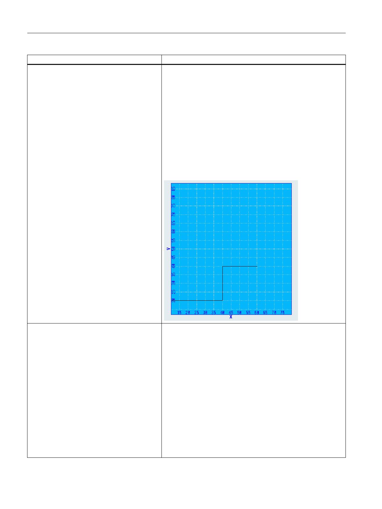
In the example, the content is assigned to the Graphicbox with the
function control.loaditem.
The control character \\n separates the graphical elements.
<control name= "c_gbox" xpos = "6" ypos="32"
width="328" height="356" fieldtype="graphicbox" />
<let name="plot_list" type="string" />
<op>
plot_list = _T"l;10;20;40;20\\n";
plot_list = plot_list + _T"l;40;20;40;40\\n";
plot_list = plot_list + _T"l;40;40;60;40\\n";
plot_list = plot_list +_T"l;80;0;80;100\\n";
</op>
<function name="control.loaditem">_T"c_gbox",
plot_list</function>
Empty
The function deletes the contents of the specified list box or graphic box
controls.
Syntax:
<function name="control.empty"> control name,
</function>
Attribute:
name - function name
Values:
control name - control name
Example:
<function name="control.empty">_T"listbox1"
</function>
Easy XML
152
Programming Manual, 12/2019, 6FC5397-1DP40-6BA3

Generating user dialogs
1.10 Predefined functions
Function name
Description
Get focus
The function supplies the name of the control, which has the input focus.
Syntax:
<function name="control.getfocus"
return="focus_name" />
Attributes:
name - function name
return - a string variable should be specified, into which the control
name is copied.
Example:
<let name>="focus_field" type="string"></let>
<function name="control.getfocus"
return="focus_field"/>
Set focus
The function sets the input focus to the specified control.
The Controlname should be transferred as text expression of the func-
tion.
Syntax:
<function name="control.setfocus"> control name
</function>
Attribute:
name - function name
Value:
control name - name of the control
Example:
<function name="control.setfocus" ">_T"listbox1"
</function>
Get cursor selection
For a list box, the function supplies the cursor index.
The Controlname should be transferred as text expression of the func-
tion.
Syntax:
<function name="control.getcurssel"
return="var">control name </function>
Example:
<let name>="index"></let>
<function name="control.getcurssel"
return="index">_T"listbox1"</function>
Easy XML
Programming Manual, 12/2019, 6FC5397-1DP40-6BA3
153

Generating user dialogs
1.10 Predefined functions
Function name
Description
Set cursor selection
For a list box, the function sets the cursor to the appropriate line.
The Controlname should be transferred as text expression of the func-
tion.
Syntax:
<function name="control.setcurssel" > control name,
index</function>
Example:
<let name>="index">2</let>
<function name="control.setcurssel"
">_T"listbox1",index</function>
Get Item
For a list box, the function copies the contents of the selected line to the
specified variable.
A string variable should be specified as reference variable.
The Controlname should be transferred as text expression of the func-
tion.
Syntax:
<function name="control.getitem" return="var">
control name, index </function>
Example:
<let name>="index">2</let>
<let name>="item" type="string"></let>
<function name="control.getitem" return="item"
">_T"listbox1",index</function>
Get Item Data
For a list box, the function copies the user-specific allocated value of an
element to the specified variable.
For an edit control, the function copies the user-specific allocated value
(item_data) to the specified variable.
An integer variable should be specified as reference variable.
The Controlname should be transferred as text expression of the func-
tion.
Syntax:
<function name="control.getitemdata" return="var">
control name, index </function>
Example:
<let name>="index">2</let>
<let name>="itemdata"></let>
<function name="control.getitemdata"
return="itemdata" ">_T"listbox1",index</function>
Easy XML
154
Programming Manual, 12/2019, 6FC5397-1DP40-6BA3
Generating user dialogs
1.10 Predefined functions
Function name
Description
Image Box Set
This function is used to control the visible area of the controls Imagebox
and Graphicbox. The call parameters to be specified are the control
name, the control command, and the associated values.
Syntax:
<function name="control.imageboxset">control name,
command, command parameter</function>
Call parameters:
●
x_offs
The function shifts the image portion to the specified X-position. A
further parameter to be specified is the coordinate of the left corner.
●
y_offs
The function shifts the image portion to the specified Y position. A
further parameter to be specified is the coordinate of the upper
corner.
●
xy_offs
The function shifts the image portion to the specified X/Y-positions.
Further parameters to be specified are the coordinates of the left
and upper corners.
●
followCursor
The image portion follows the set cursor position.
●
zoomplus
The image is enlarged by a factor of 0.12.
●
zoomminus
The image is reduced by a factor of 0.12.
●
autozoom
The image will automatically be scaled to fit the display area.
●
Update
The control is redrawn.
●
SetBkColor
The command sets the specified backg12round color. A further
parameter to be specified is the color coding.
●
SetCursorRect
The portion specified as a rectangle is shifted into the visible area.
●
SetAnimationState (only applies to the Imagebox control)
- start - The command starts an animation.
- stop - The command stops an animation.
Easy XML
Programming Manual, 12/2019, 6FC5397-1DP40-6BA3
155

Generating user dialogs
1.10 Predefined functions
Function name
Description
Image Box Set continued
Example:
<softkey POSITION="1">
<caption>zoom%nin</caption>
<function name="control.imageboxset">_T"c_gbox",
_T"zoomplus"</function>
</softkey>
<form name = "main_form">
<init>
<caption> graphicbox</caption>
<control name= "c_gbox" xpos = "6" ypos="32"
width="328" height="356" fieldtype="graphicbox" />
<let name="plot_list" type="string" />
<op>
plot_list = _T"l;10;20;40;20\\n";
plot_list = plot_list + _T"l;40;20;40;40\\n";
plot_list = plot_list + _T"l;40;40;60;40\\n";
plot_list = plot_list +_T"l;80;0;80;100\\n";
</op>
<function name="control.loaditem">_T"c_gbox",
plot_list</function>
</init>
</form>
Image Box Get
This function is for querying the control properties image box. The call
parameters to be specified are the control command and the associated
values.
Syntax:
<function name="control.imageboxget">control name,
command, command parameter</function>
Call parameters:
GetViewSize
Returns the size of the display area
A further parameter to be specified is the variable with structure type
SIZE.
Example:
<let name="view_size" type="size" />
<function name="control.imageboxget">_T"topoview",
_T"GetViewSize", view_size</function>
Easy XML
156
Programming Manual, 12/2019, 6FC5397-1DP40-6BA3

Generating user dialogs
1.10 Predefined functions
Function name
Description
Bitmap Dim
The function copies the dimension of a bitmap back into a variable with
structure type SIZE. To define the type, file struct_def.xml must be in-
cluded in the project.
Syntax:
<function name="bitmap.dim" >name, variable type
</function>
Parameter:
name - file path
variable type - variable name of a variable of type SIZE
Example:
<let name="bmp_size" type="size" />
<function name="bitmap.dim" >_T"test.bmp", bmp_size
</function>
Screen Resolution
The function copies the absolute screen resolution of the system back
into a variable with structure type SIZE. To define the type, file
struct_def.xml must be included in the project.
Syntax:
<function name="hmi.screen_resolution"
>varialble type </function>
Get HMI Resolution
The function copies the screen resolution used by SINUMERIK Operate
back into a variable with structure type SIZE. To define the type, file
struct_def.xml must be included in the project.
Syntax:
<function name="hmi.get_hmi_resolution"
>variable type </function>
Get Caption Height
The function returns the title bar height in pixels.
Syntax:
<function name="hmi.get_caption_height"
return="<return var>" />
Attributes:
return - integer variable
Abs
This function returns the absolute value of the specified number.
Syntax:
<function name="abs" return="var"> value
</function>
Easy XML
Programming Manual, 12/2019, 6FC5397-1DP40-6BA3
157

Generating user dialogs
1.10 Predefined functions
Function name
Description
SDEG
The function converts the specified value into degrees.
Syntax:
<function name="sdeg" return="var"> value
</function>
SRAD
The function converts the specified value into RADian.
Syntax:
<function name="srad" return="var"> value
</function>
SQRT
The function calculates the square root of the specified value.
Syntax:
<function name="sqrt" return="var"> value
</function>
ROUND
The function rounds of the transferred number to the specified number
of decimal places. If the number of decimal places is not specified, then
the function rounds off the number, taking into account the first decimal
place.
Syntax:
<function name="round" return="var"> value,
nDecimalPlaces </function>
FLOOR
The function supplies the largest possible integer value, which is less
than or equal to the transferred value.
Syntax:
<function name="floor" return="var"> value
</function>
CEIL
The function supplies the smallest possible integer value, which is
greater than or equal to the transferred value.
Syntax:
<function name="ceil" return="var"> value
</function>
LOG
The function calculates the logarithm of the specified value.
Syntax:
<function name="log" return="var"> value </function>
LOG10
The function calculates the common (decadic) logarithm of the speci-
fied value.
Syntax:
<function name="log10" return="var"> value
</function>
Easy XML
158
Programming Manual, 12/2019, 6FC5397-1DP40-6BA3

Generating user dialogs
1.10 Predefined functions
Function name
Description
POW
The function calculates the value "ab".
Syntax:
<function name="pow" return="var"> a, b </function>
MIN
The function compares the transferred value and returns the lower of
the values.
Syntax:
<function name="min" return="var"> value1, value2
</function>
MAX
The function compares the transferred value and returns the higher of
the values.
Syntax:
<function name="max" return="var"> value1, value2
</function>
RANDOM
The function returns a pseudo random number.
Syntax:
<function name="random" return="var" </function>
Easy XML
Programming Manual, 12/2019, 6FC5397-1DP40-6BA3
159
Generating user dialogs
1.10 Predefined functions
Function name
Description
MMC
Function:
You can use the MMC command to display user-defined dialog forms
from the part program in SINUMERIK Operate. The appearance of the
dialog forms is defined in a pure text configuration (XML file in the man-
ufacturer directory). The system software remains unchanged.
Due to changes in the operate base system, the parameters are as
follows:
XML → CYCLES or POPUPDLG
XML_ON → PICTURE_ON
XML_OFF → PICTURE_OFF
Syntax:
MMC ("operating area, command, XML script file, menu name, re-
served, reserved, display time or acknowledgment variable, reserved",
"acknowledgment mode")
Meaning:
● MMC
Calling the dialog form interactively from the part program in
SINUMERIK Operate.
● EasyXml
Identification for user dialogs that are to be started from a part
program.
● XML_ON or XML_OFF
Command: Selection or deselection of a dialog
● XML file
Name of the XML script file
● Menu
Name of the menu tag that manages the dialog to be displayed
● reserved
reserved for SINUMERIK Operate
● reserved
reserved for SINUMERIK Operate
● Time
Display time of the dialog for acknowledgment mode "N"
● reserved
reserved for SINUMERIK Operate
● Acknowledgment mode
"S" synchronous, acknowledgment via the "OK" softkey
"N" asynchronous, dialog closes after the set time
Easy XML
160
Programming Manual, 12/2019, 6FC5397-1DP40-6BA3

Generating user dialogs
1.10 Predefined functions
Function name
Description
MMC continued
Example of synchronous call:
Due to changes in the operate base system, the parameters are as
follows:
XML → CYCLES or POPUPDLG
XML_ON → PICTURE_ON
XML_OFF → PICTURE_OFF
NC instruction
MMC("EASYXML oder
CYCLES”,XML_ON,mmc_cmd.xml,cmd1,,,,,","S")
File: mmc_cmd.xml
<menu name = "cmd1">
<open_form name = "cmd1_form" />
<softkey_ok>
<close_form />
</softkey_ok>
</menu>
<form name = "cmd1_form" xpos ="12" ypos="100"
width="500" height="240">
<init>
</init>
<paint>
</paint>
</form>
Example of asynchronous call (acknowledgment not expected):
Due to changes in the operate base system, the parameters are as
follows:
XML → CYCLES or POPUPDLG
XML_ON → PICTURE_ON
XML_OFF → PICTURE_OFF
NC instruction
MMC("EASYXML oder
CYCLES”,PICTURE_ON,mmc_cmd.xml,cmd1,,,10,,","N")
File: mmc_cmd.xml <menu name = "cmd1">
<open_form name = "cmd1_form" />
<softkey_ok>
<close_form />
</softkey_ok>
</menu>
<form name = "cmd1_form" xpos ="12" ypos="100"
width="500" height="240">
<init>
</init>
<paint>
</paint>
</form>
Easy XML
Programming Manual, 12/2019, 6FC5397-1DP40-6BA3
161

Generating user dialogs
1.10 Predefined functions
Function name
Description
MMC continued
Example of extraction of script parts from a part program:
Due to changes in the operate base system, the parameters are as
follows:
XML → CYCLES or POPUPDLG
XML_ON → PICTURE_ON
XML_OFF → PICTURE_OFF
NC instruction
MMC(“XML,XML_ON,XMLDIAL_EMB.XML,main","S")
File: xmldial_emb.xml
<DialogGui>
<let name="menu_name" type="string">main</let>
<let name="script_loaded">0</let>
<menu name = "main">
<if>
<condition>script_loaded == 0</condition>
<then>
<function name ="load_current_program" />
<dynamic_include src="__tmp.xml" />
<op>
script_loaded = 1;
</op>
<navigation>$$$menu_name</navigation>
</then>
</if>
<softkey_back>
<close_form />
</softkey_back>
</menu>
<function_body name ="load_current_program" >
<let name="prog_name" type= "string"/>
<let name="contents" type= "string"/>
<let name="entry" type= "string"/>
<let name="len" />
<op> prog_name = "nck/Channel/ProgramInfo/
workPandProgName"</op>
<function name="DOC.LOADSCRIPT"
return="contents">prog_name, _T"main_dialog",
entry</function>
<function name="string.length"
return="len">contents</function>
<if>
<condition>len > 0</condition>
<then>
<op>
menu_name = entry;
</op>
<function name="doc.writetofile" >_T"__tmp.xml",
contents</function>
</then>
</if>
</function_body>
</DialogGui>
Easy XML
162
Programming Manual, 12/2019, 6FC5397-1DP40-6BA3
Generating user dialogs
1.10 Predefined functions
Function name
Description
MMC continued
Programming example
;<main_dialog entry="rpara_main">
; <let name="xpos" />
; <let name="ypos" />
; <let name="field_name" type="string" />
; <let name="num" />
; <menu name="rpara_main">
; <open_form name="rpara_form"/>
; <softkey_back>
; <close_form />
; </softkey_back>
;</menu>
;
;<form name="rpara_form">
; <init>
; <caption>test mask</caption>
; <let name="count" >0</let>
; <op>
; xpos = 120;
; ypos = 34;
;
; "nck/Channel/Parameter/R[10]" = 10;
; </op>
; <!-- load the number of controls -->
; <op>
; num = "nck/Channel/Parameter/R[10]";
; </op>
;
; <while>
; <condition>count < num</condition>
; <print name="field_name" text="edit%d">count</
print>
;
; <control name = "$field_name" xpos = "$xpos" ypos
= "$ypos" refvar="nck/Channel/Parameter/R[$count]"
hotlink="true" />
; <op>
; ypos = ypos +24;
; count = count +1;
; </op>
; </while>
;
; </init>
;
; <paint>
; <op>
; xpos = 8;
; ypos = 36;
; count = 0;
; </op>
; <while>
; <condition>count < num</condition>
; <print name="field_name" text="R-Parameter
%d">count </print>
Easy XML
Programming Manual, 12/2019, 6FC5397-1DP40-6BA3
163

Generating user dialogs
1.10 Predefined functions
Function name
Description
;
; <text xpos = "$xpos" ypos = "$ypos" >$$
$field_name</text>
; <op>
; ypos = ypos +24;
; count = count +1;
; </op>
; </while>
;
; </paint>
;
;</form>
;
;</main_dialog>
…
G94 F100
MMC(“XML,XML_ON,XMLDIAL_EMB.XML,main","A")
…
…
…
MMC(“XML,XML_OFF,XMLDIAL_EMB.XML,main","A")
G4 F2
M2
ISNUMERIC
The function checks the content of a string as to whether this can be
evaluated as number. Spaces and tabs are ignored. The sign and the
decimal point are still considered as valid characters. The function re-
turns a value of 1 if the conditions are satisfied.
Parameter:
string - Character string
Syntax:
<function name="isnumeric" return="result"><string>
</function>
ROOT
The function extracts the nth root from a number.
Parameter:
value - Number
n - Exponent of a root
Syntax:
<function name="ROOT" return="result"><value>, <n></
function>
Easy XML
164
Programming Manual, 12/2019, 6FC5397-1DP40-6BA3
Generating user dialogs
1.11 Multitouch operation
1.11
Multitouch operation
1.11.1
Multitouch function
Overview
When multitouch displays are introduced, it is necessary to adjust operation to the extended
functionality of the display. The rigid positioning of softkeys, for example, is eliminated and
replaced or supplemented by free positioning of buttons. Due to the diversity of design options
for buttons, it no longer makes sense to use just one control for programming whose
appearance is based exclusively on the design specifications of the operating software. Toggle
controls, which only know two states, can be replaced by switches, for example, that show the
respective state by means of an icon and react to tap or flick gestures.
Displays graphics can be given the capability of reacting to pan gestures. The imagebox control
has been extended for this purpose.
Note
Graphics displayed in the paint tag still do not react to gestures.
Outside of the controls provided by the parser, finger gestures can be processed in the script,
thus providing the option, for example, of offering new navigation strategies in the dialogs.
Finger gestures could be used for zooming in to/out of dialog contents.
The Easy XML parser supports the following finger gestures:
Finger gestures
Tap
● Select window
● Select object (e.g. NC set)
● Activate entry field
- Enter or overwrite value
- Tap again to change the value
Flick vertically with one finger
● Scroll in lists (e.g. programs, tools, zero points)
● Scroll in files (e.g. NC program)
Easy XML
Programming Manual, 12/2019, 6FC5397-1DP40-6BA3
165
Generating user dialogs
1.11 Multitouch operation
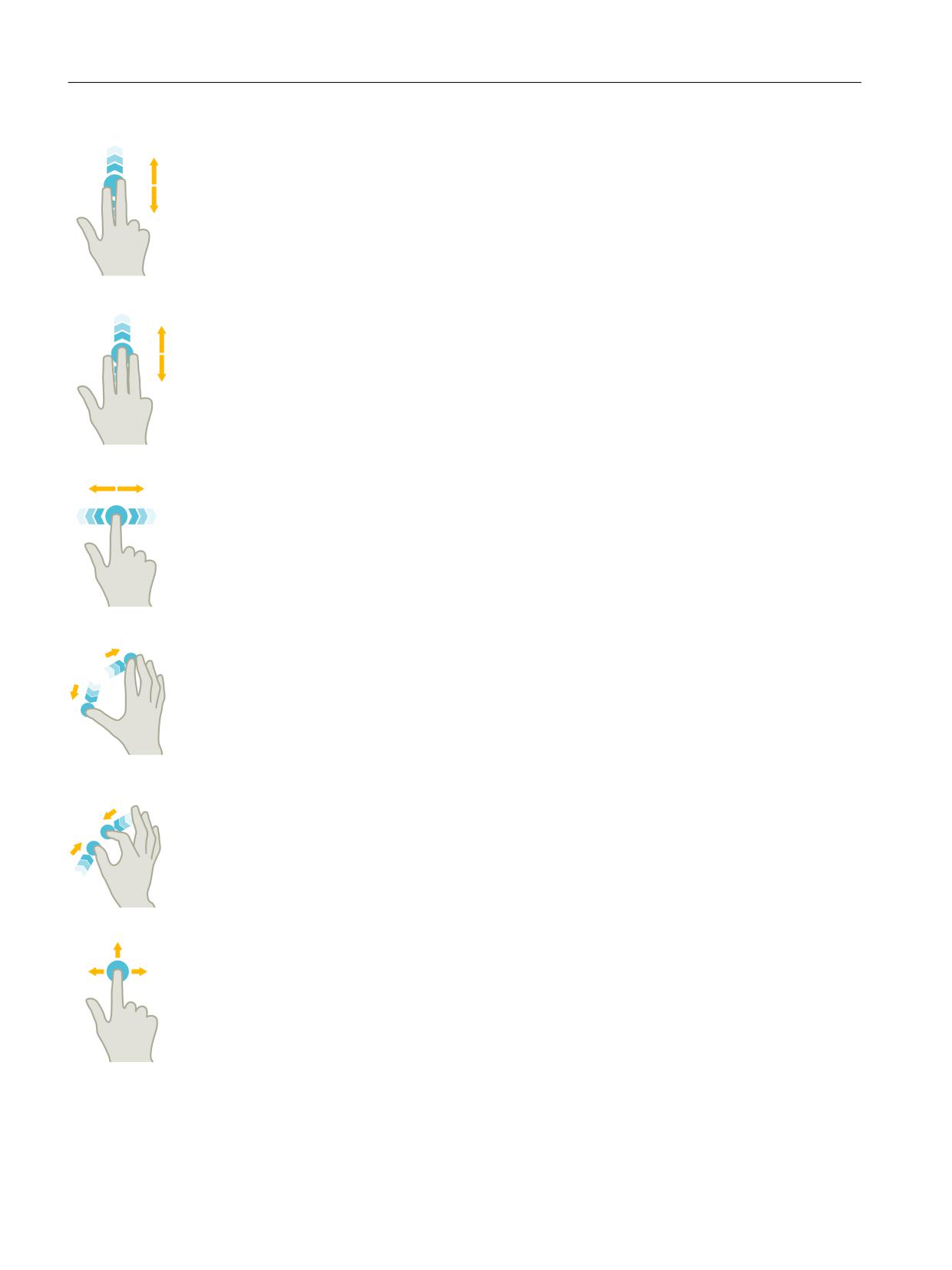
Flick vertically with two fingers
● Page-scroll in lists (e.g. ZO)
● Page-scroll in files (e.g. NC programs)
Flick vertically with three fingers
● Scroll to the start or end of lists
● Scroll to the start or end of files
Flick horizontally with one finger
● Scroll in lists with many columns
Spread
● Zoom in to graphic contents (e.g. simulation, mold making view)
Pinch
● Zoom out from graphic contents (e.g. simulation, mold making view)
Pan with one finger
● Move graphic contents (e.g. simulation, mold making view)
● Move list contents
The gesture_event tag and the $gestureinfo variable are used for handling finger gestures. The
enable program actions for decoded finger gestures.
Easy XML
166
Programming Manual, 12/2019, 6FC5397-1DP40-6BA3
Generating user dialogs
1.11 Multitouch operation
1.11.2
Programming finger gestures
gesture_event tag
Note
This tag is only executed if the operating software's gesture control has been activated.
If the operating software recognizes a finger gesture, the parser provides the gesture
information in the $gestureinfo variable and executes the gesture_event tag. The variable
possesses the GestureInfoStruct data type and contains the following attributes:
Attribute
Value
Meaning
type
3
Pan gesture
4
Zoom out gesture
5
Tap gesture
flag
1
Scaling factor changed
2
Angle of rotation changed
state
1
Started
2
Updated
3
Completed
item_data
Identification of the active control
-1
The gesture is not assigned to a control
!= -1
The gesture was executed in a control to which this
value was assigned during creation
point
Position of the gesture
point.x
X position of the gesture
point.y
Y position of the gesture
delta
Difference between the start of the gesture and the
current event
<Scaling difference>
When scaling factor is changed
<Angular difference>
When angle of rotation is changed
These attributes are predefined in the struct_def.xml file.
Easy XML
Programming Manual, 12/2019, 6FC5397-1DP40-6BA3
167
Generating user dialogs
1.11 Multitouch operation
1.11.3
Gesture control for graphics
Imagebox control variable
The following three extensions are available for the gesture control of graphics when using
the Imagebox control variable:
Attribute
Meaning/behavior
rotationangle
This attribute value indicates the angle at which the graphic is to be dis-
played.
setrotationmode
The true attribute value allows processing of the pinch gesture
setzoommode
The true attribute value allows you to zoom in to/out from or move a graphic
in the display area. This default setting of this attribute is false.
Syntax
<property rotationangle="angle" />
<property setrotationmode="true/false" />
<property setzoommode="true/false" />
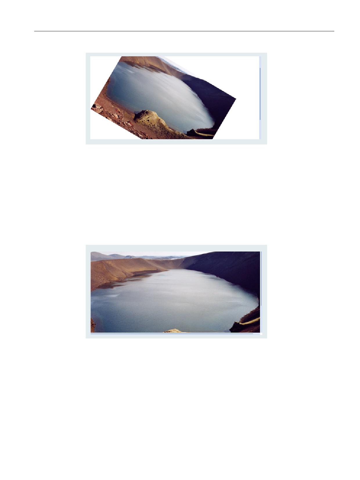
Example of bitmap rotation
Rotate bitmap by 30.5 degrees clockwise:
<let name="image_box_pict_name" type="string" >pic1.bmp</let>
…
…
…
<control name="image_view" xpos="100" ypos="123" width="300"
height="200" fieldtype="imagebox" refvar="image_box_pict_name"
hotlink="true" >
<property item_data="1000" />
<property rotationangle="30.5" />
<property setrotationmode ="true" />
</control>
Easy XML
168
Programming Manual, 12/2019, 6FC5397-1DP40-6BA3
Generating user dialogs
1.11 Multitouch operation
Example of bitmap zooming
Allowing zooming for a bitmap:
<control name="image_view" xpos="100" ypos="123" width="300"
height="200" fieldtype="imagebox" refvar="image_box_pict_name"
hotlink="true" >
<property item_data="1000" />
<property setzoommode="true" />
</control>
imageboxset control function
The properties can also be set using the control.imageboxset function.
Easy XML
Programming Manual, 12/2019, 6FC5397-1DP40-6BA3
169
Generating user dialogs
1.11 Multitouch operation
The following commands are available:
Command
Meaning/behavior
SetRotationAngle
The graphic is rotated around the angle indicated in lparam1.
SetRotationMode
The value of lparam1 defines the evaluation of the pinch gesture with respect
to the rotation.
Value equal to 1 - the gesture is processed by the control
SetZoomMode
If the value of lparam1 is equal to 1, the pinch gesture for zooming in to/out
from or moving the graphic is evaluated.
Easy XML
170
Programming Manual, 12/2019, 6FC5397-1DP40-6BA3
Generating user dialogs
1.11 Multitouch operation
1.11.4
Gesture processing
Tag message
If the scaling factor is greater than 1.0, the image in the display area will be moved. If the factor
is 1.0, this finger gesture can be used for browsing through a list of images, for example. In this
case, the parser sends a message to the form, which can be evaluated in the message tag.
The $message_par1 message parameter contains the Item_Data value of the control. The
$message_par2 message parameter signals the gesture's direction of movement.
The $message_par2 can accept the following values:
●
-1 roll left
●
1 roll right
●
-2 roll up
●
2 roll down
Example
…
…
<let name="image_box_pict_name" type="string" ></let>
<let name="pictindex" />
<let name="image_box_list" type="string" dim="4">
"pic1.bmp",
"pic2.bmp",
"pic3.bmp",
"pic4.bmp",
</let>
…
…
<control name="image_view" xpos="100" ypos="123" width="300"
height="200" fieldtype="imagebox" refvar="image_box_pict_name"
hotlink="true" >
<property item_data="1000" />
<property setzoommode="false" />
</control>
…
…
…
<!--
-1 roll left
1 roll right
-2 roll up
2 roll down
-->
<message>
<if condition="$message_par1 == 1000">
<then>
Easy XML
Programming Manual, 12/2019, 6FC5397-1DP40-6BA3
171
Generating user dialogs
1.11 Multitouch operation
<switch>
<condition>$message_par2</condition>
<case value="1">
<op>
pictindex = pictindex+1;
</op>
<if condition="pictindex > 3">
<then>
<op>
pictindex = 0;
</op>
</then>
</if>
</case>
<case value="-1">
<op>
pictindex = pictindex-1;
</op>
<if condition="pictindex < 0">
<then>
<op>
pictindex = 3;
</op>
</then>
</if>
</case>
</switch>
<op>
image_box_pict_name = image_box_list[$pictindex];
</op>
</then>
</if>
</message>
…
…
Easy XML
172
Programming Manual, 12/2019, 6FC5397-1DP40-6BA3
Generating user dialogs
1.12 Configuring your own buttons
1.12
Configuring your own buttons
Buttons can be integrated into a form as action buttons or selection buttons.
1.12.1
Pushbutton
Tag property
The pushbutton is a control element that can be used as a button or a switch (button with
latching function). The button can be designed by means of attribute definitions in the "softkey
look & feel" style as well as in a customized style. The relevant attributes must be defined with
the property tag.
The foreground or backg12round color can be changed using the color_fg, color_bk,
color_fg_pressed and color_bk_pressed attributes.
The pressed/locked or released states are represented by the values one or zero. A handler
function must be indicated to evaluate a button's change of state. The handler function is
indicated with the function attribute in the control tag.
The state of a switch can be determined by reading out the control variable or an assigned
reference variable.
With a touch operation, the finger gestures are "pressed" and "released" only when the finger
gesture is "let go".
Syntax
<control name="name" xpos="x position" ypos="y position"
fieldtype="pushbutton" >
<caption></caption>
</control>
Or with handler function
<control name="name" xpos="x position" ypos="y position"
fieldtype="pushbutton" function="button_handler" hotlink="true" >
<caption></caption>
</control>
…
…
…
<function_body name="button_handler">
…
…
…
</function_body>
or
Easy XML
Programming Manual, 12/2019, 6FC5397-1DP40-6BA3
173
Generating user dialogs
1.12 Configuring your own buttons
<control name="name" xpos="x position" ypos="y position"
fieldtype="pushbutton" refvar="button_state" hotlink="true" >
<caption></caption>
<property checkable="true" />
</control>
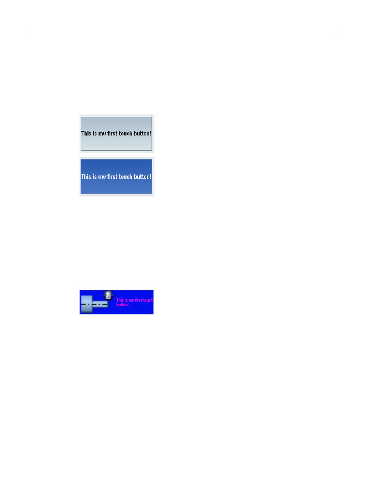
Deactivated
Activated, latched
Example
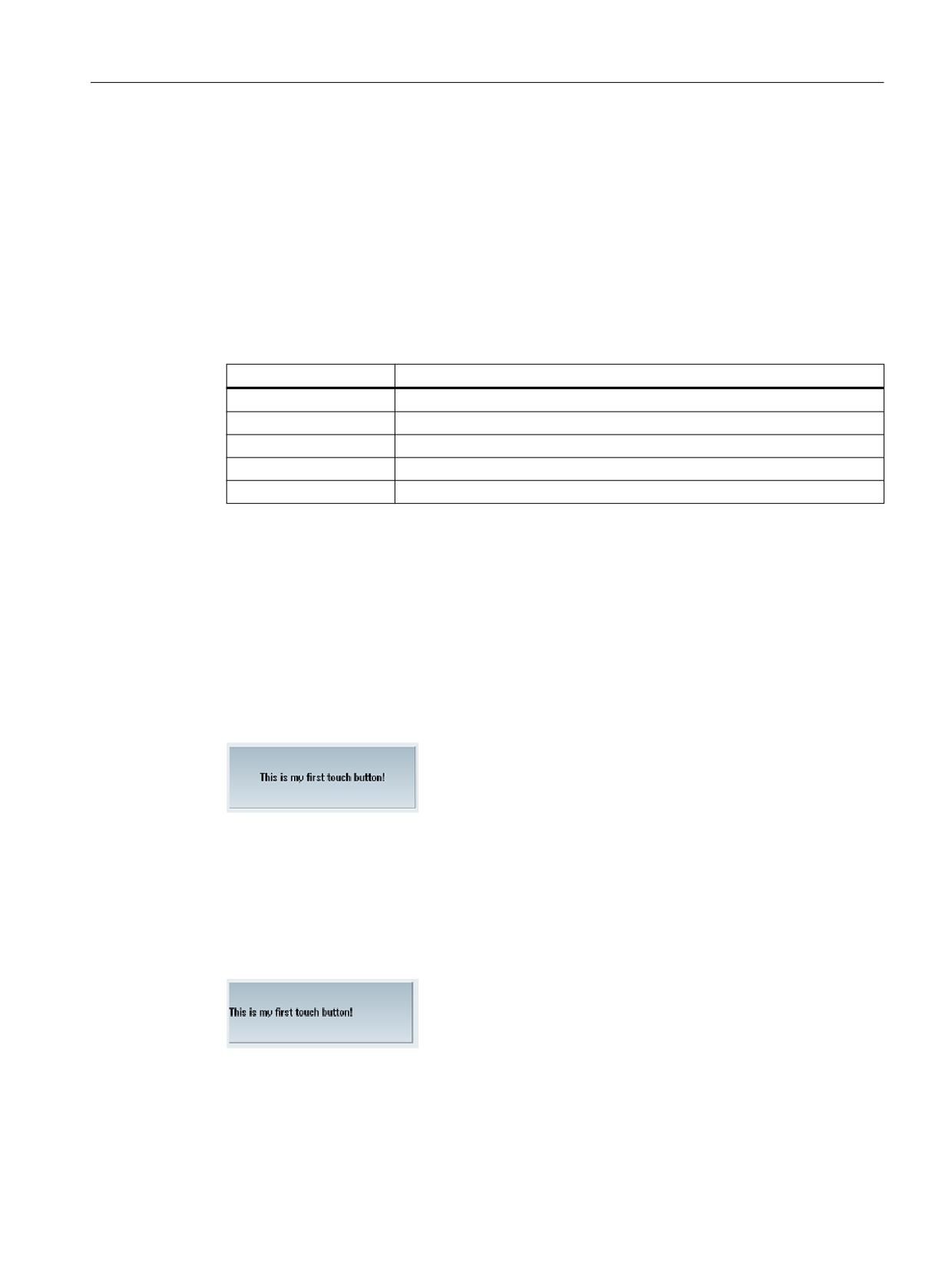
<control name="name" xpos="x position" ypos="y position"
fieldtype="pushbutton" refvar="button_state" hotlink="true"
color_fg="#ff00ff" color_bk="#000eee">
<property checkable="true" />
<caption></caption>
<property picture="sk_circ_grind_cg.png" alignment="left"
TextAlignedToPicture="true" scaled="true"/>
</control>
Easy XML
174
Programming Manual, 12/2019, 6FC5397-1DP40-6BA3
Generating user dialogs
1.12 Configuring your own buttons
1.12.2
Functions of the pushbutton
1.12.2.1
Sub-tags for the pushbutton
Tag caption
The programmer uses the caption tag to specify the button text to be displayed for the "not
pressed" state. In the default setting, the text is centered. The text alignment can be changed
with the alignment attribute. The following attribute values can be specified:
Attribute value
Alignment
left
Left-aligned
right
Right-aligned
top
Top
bottom
Bottom
center
Centered
If a different text is to be displayed for the "pressed" state, a second caption instruction must be
programmed with the pressed attribute and the true value.
Syntax
Centered display
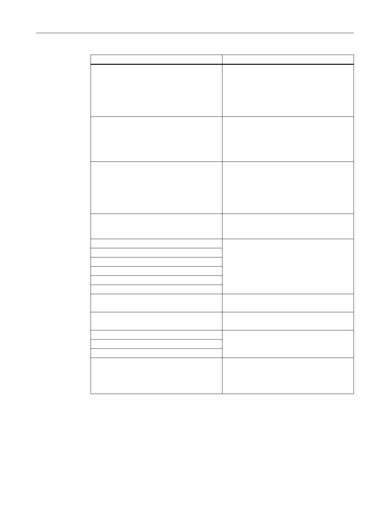
<control name="name" xpos="x position" ypos="y position"
fieldtype="pushbutton" >
<caption>Button text</caption>
</control>
Left-aligned display
<control name="name" xpos="x position" ypos="y position"
fieldtype="pushbutton" >
<caption alignment= "left">Button text</caption>
</control>
Easy XML
Programming Manual, 12/2019, 6FC5397-1DP40-6BA3
175
Generating user dialogs
1.12 Configuring your own buttons
Pressed display
<control name="name" xpos="x position" ypos="y position"
fieldtype="pushbutton" >
<caption pressed=“true“>Button text pressed</caption>
</control>
Easy XML
176
Programming Manual, 12/2019, 6FC5397-1DP40-6BA3
Generating user dialogs
1.12 Configuring your own buttons
1.12.2.2
Properties for the pushbutton
Additional properties are assigned to the control with the property tag.
Determining button properties
The checkable attribute allows the button to be used as a switch. To do so, the value of the
attribute must be set to true.
Syntax
<control name="name" xpos="x position" ypos="y position"
fieldtype="pushbutton" >
<property checkable="true/false" />
</control>
Disabling a switch
The disabled attribute controls whether or not the button can be operated. If the value is true,
control actions are not processed.
Changes in state caused by an assigned reference variable result in updating of the button.
Syntax
<property disabled="true/false" />
Example
<control name="name" xpos="x position" ypos="y position"
fieldtype="pushbutton" >
<caption alignment=“left“>Button text</caption>
<property disabled="true " />
</control>
Assigning icons
The predefined design can be covered over by specifying your own icons or button colors. An
icon can be assigned to the button for each of the states "not pressed", "pressed" and
"disabled". If there is no assignment for the states "pressed" or "disabled", the control displays
the icon for the "not pressed" state.
Other attributes control the alignment, scaling and transparency of each icon.
Attribute
Meaning/behavior
Picture
Icon in foreground
Name of the icon for the "not pressed" state
PicturePressed
Icon in foreground
Name of the icon for the "pressed" state
PictureDisabled
Icon in foreground
Name of the icon for the "disabled" state
Easy XML
Programming Manual, 12/2019, 6FC5397-1DP40-6BA3
177

Generating user dialogs
1.12 Configuring your own buttons
Attribute
Meaning/behavior
BackgroundPicture
Icon in backg12round
Name of the icon for the "not pressed" state
BackgroundPicturePressed
Icon in backg12round
Name of the icon for the "pressed" state
BackgroundPictureDisabled
Icon in backg12round
Name of the icon for the "disabled" state
Alignment attribute
Further attributes can be specified in the tag whose values refer to the alignment of the listed
icon assignments:
Attribute value
Alignment
left
Left-aligned
right
Right-aligned
top
Top
bottom
Bottom
center
Centered
stretch
Background icon:
If the stretch value is used, the parser scales the icon to the rectangular area
of the button.
Any desired outline can be generated for the button by declaring the trans-
parent color with the transparent attribute.
Easy XML
178
Programming Manual, 12/2019, 6FC5397-1DP40-6BA3

Generating user dialogs
1.12 Configuring your own buttons
1.12.2.3
Control variables for the pushbutton
Button properties can be subsequently changed by assigning new values to the attribute
variables listed below. The values are assigned in an operation instruction by specifying the
control name followed by the control variable name. The two names must separated by a
period.
Syntax
<Control-Name>.<Control-Variable>
Control variable
Meaning/behavior
backg12roundpicture
Variable type: String
Name of backg12round icon
backg12roundpicturedisabled
Variable type: String
Name of backg12round icon for the disabled state
backg12roundpicturepressed
Variable type: String
Name of backg12round icon for the pressed state
picture
Variable type: String
Name of foreground icon
picturedisabled
Variable type: String
Name of foreground icon for the disabled state
picturepressed
Variable type: String
Name of foreground icon for the pressed state
picture_textalignedtopicture
Variable type: Bool
Value:
1 = true
0 = false
Button text is aligned on the icon
picturedisabled_textalignedtopicture
Variable type: Bool
Value:
1 = true
0 = false
Button text is aligned on the "disabled state" icon
picturepressed_textalignedtopicture
Variable type: Bool
Value:
1 = true
0 = false
Button text is aligned on the "pressed state" icon
backg12roundpicture_keepaspectratio
Variable type: Bool
Value:
1 = true
0 = false
The aspect ratio of the backg12round icon is retained
or ignored
Easy XML
Programming Manual, 12/2019, 6FC5397-1DP40-6BA3
179

Generating user dialogs
1.12 Configuring your own buttons
Control variable
Meaning/behavior
backg12roundpicturedisabled_keepaspectratio
Variable type: Bool
Value:
1 = true
0 = false
The aspect ratio of the "disabled state" back-
ground icon is retained or ignored
backg12roundpicturepressed_keepaspectratio
Variable type: Bool
Value:
1 = true
0 = false
The aspect ratio of the "pressed state" backg12round
icon is retained or ignored
picture_keepaspectratio
Variable type: Bool
Value:
1 = true
0 = false
The aspect ratio of the icon is retained or ignored
picturedisabled_keepaspectratio
Variable type: Bool
Value:
1 = true
0 = false
The aspect ratio of the "disabled state" icon is re-
tained or ignored
picturepressed_keepaspectratio
Variable type: Bool
Value:
1 = true
0 = false
The aspect ratio of the "pressed state" icon is re-
tained or ignored
backg12roundpicture_scaled
Variable type: Bool
Value:
1 = true
0 = false
The backg12round icon is adjusted to the dimensions
of the button
backg12roundpicturedisabled_scaled
Variable type: Bool
Value:
1 = true
0 = false
The "disabled state" backg12round icon is adjusted
to the dimensions of the button
Easy XML
180
Programming Manual, 12/2019, 6FC5397-1DP40-6BA3
Generating user dialogs
1.12 Configuring your own buttons
Control variable
Meaning/behavior
backg12roundpicturepressed_scaled
Variable type: Bool
Value:
1 = true
0 = false
The "pressed state" backg12round icon is adjusted to
the dimensions of the button
picture_scaled
Variable type: Bool
Value:
1 = true
0 = false
The icon is adjusted to the dimensions of the button
picturedisabled_scaled
Variable type: Bool
Value:
1 = true
0 = false
The "disabled state" icon is adjusted to the dimen-
sions of the button
picturepressed_scaled
Variable type: Bool
The "pressed state" icon is adjusted to the dimen-
sions of the button
backpicture_alignment
Variable type: String
backg12roundpicturedisabled_alignment
See attribute alignment
backg12roundpicturepressed_alignment
picture_alignment
picturedisabled_alignment
picturepressed_alignment
caption
Variable type: String
"Not pressed state" button text
captionpressed
Variable type: String
"Pressed state" button text
caption_alignment
Variable type: String
captionpressed_alignment
See attribute alignment
captiondisabled_alignment
disabled
Variable type: Bool
Value:
1 = true - pushbutton disabled
0 = false - pushbutton can be operated
Easy XML
Programming Manual, 12/2019, 6FC5397-1DP40-6BA3
181
Generating user dialogs
1.12 Configuring your own buttons
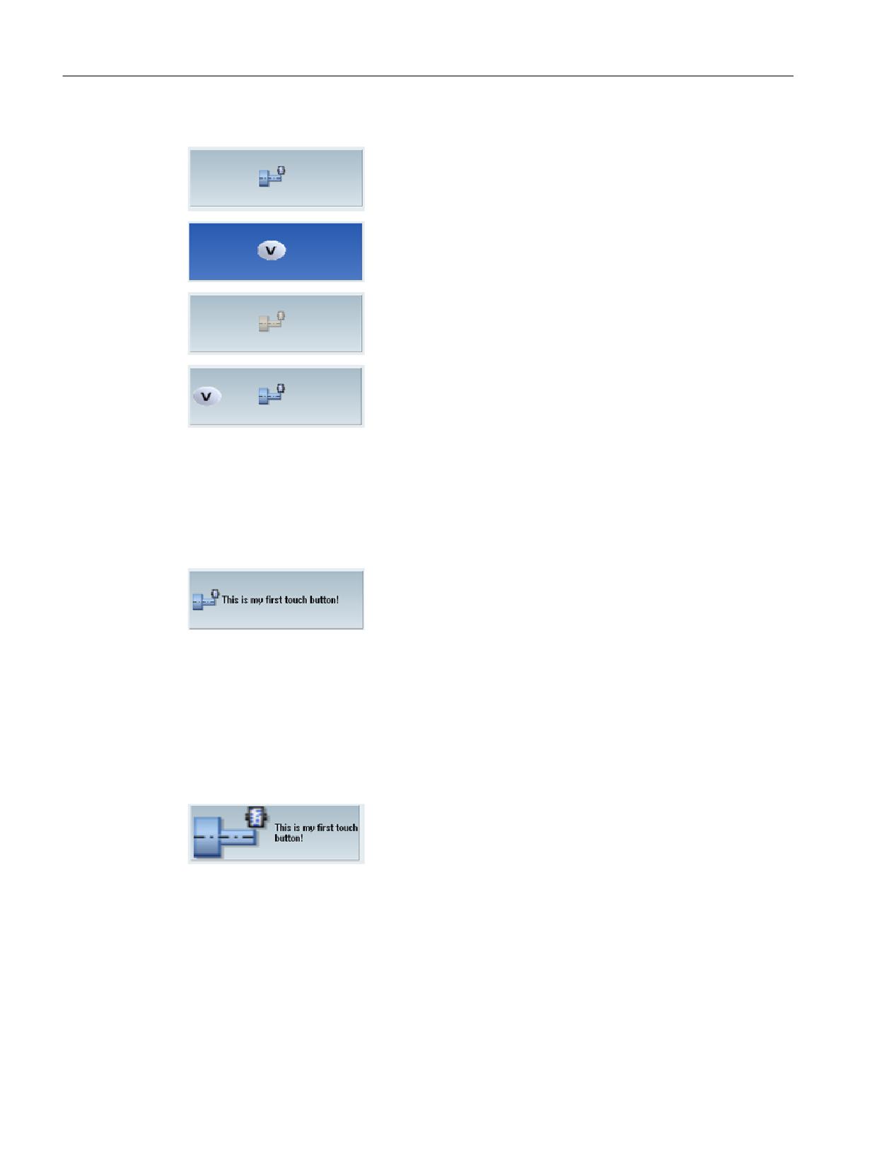
Picture
PicturePressed
PictureDisabled
BackgroundPicture + Picture
TextAlignedToPicture attribute
If the value of the attribute is true, the text is aligned relative to the icons.
<property picture="sk_circ_grind_cg.png" alignment="left"
TextAlignedToPicture="true" />
Scaled attribute
If the value of the attribute is true, the dimensions of the image are adjusted to the dimensions
of the button in such a way that 50% of the height or width of the button at most is made
available for the graphic.
<property picture="sk_circ_grind_cg.png" alignment="left"
TextAlignedToPicture="true" scaled="true"/>
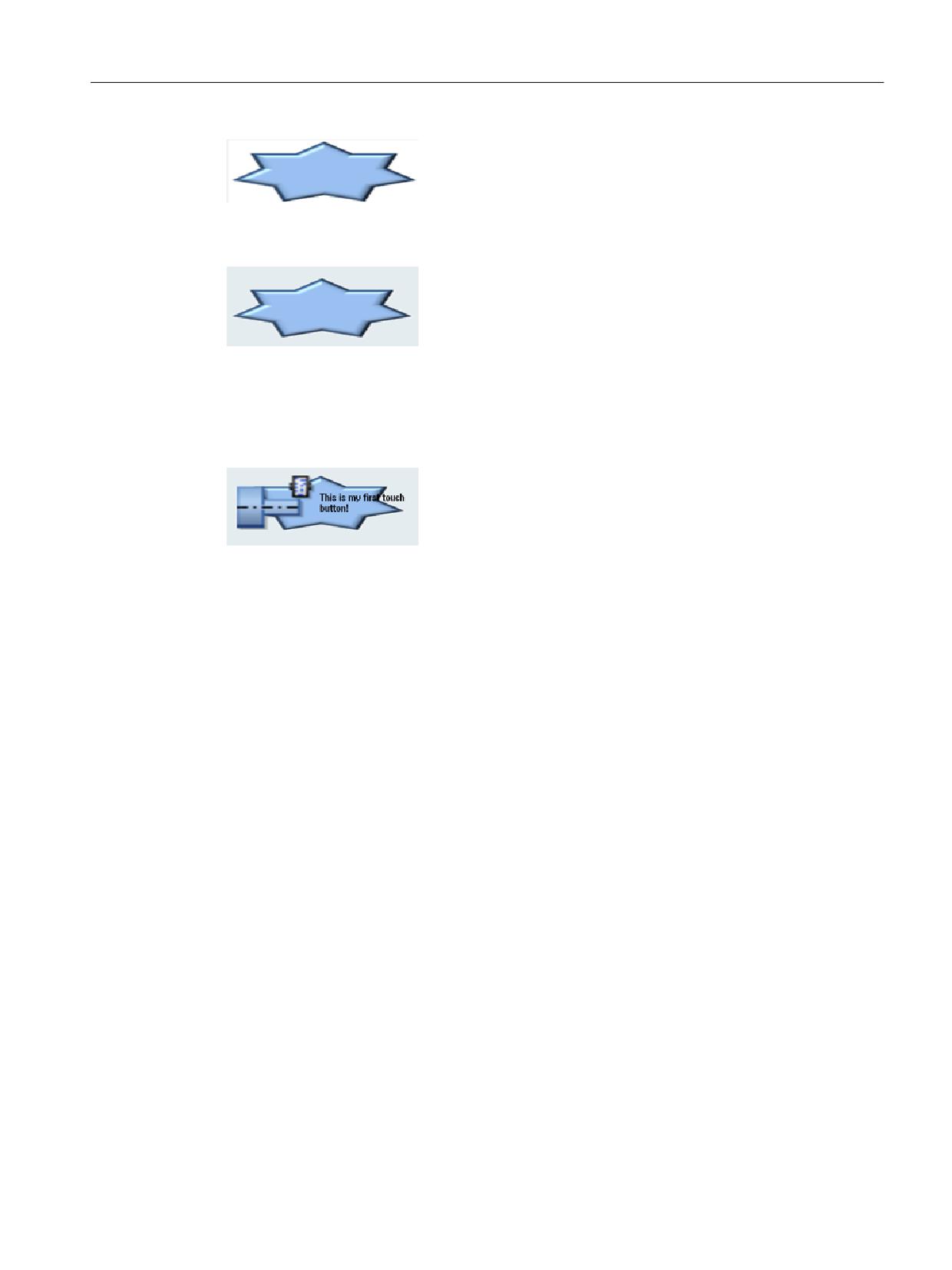
Stretch attribute (only effective for backg12round icons)
If the value of the attribute is true, the dimensions of the image are adjusted to the dimensions
of the button.
<property backg12roundpicture="f:\appl\pbutton.png"
alignment="stretch" />
Easy XML
182
Programming Manual, 12/2019, 6FC5397-1DP40-6BA3
Generating user dialogs
1.12 Configuring your own buttons
<property backg12roundpicture="f:\appl\pbutton.png"
alignment="stretch" transparent="#ffffff"/>
<caption alignment="left" >This is my first touch button!</caption>
<property picture="sk_circ_grind_cg.png" alignment="left"
TextAlignedToPicture="true" scaled="true"/>
<property backg12roundpicture="pbutton.png" alignment="stretch"
transparent="#ffffff"/>
1.12.3
Switch on/off
A switch control is a graphic element that signals one of two states by means of an icon. This
control can be operated by touch or by using a mouse.
The state adopted can be stored in a reference variable or the change of state can be
determined in a function assigned to the control. The function is assigned with the function
attribute in the control tag.
The alignment attribute enables the vertical or horizontal alignment of the button.
This control has no standard design. If no icons are assigned to the control, only the bounding
box and switch position (shown by a dot) are displayed.
Syntax
<control name="name" xpos = "x position" ypos="y position"
width="width" height="height" fieldtype="switch" alignment="hr/vr">
<property left_position="value" />
<property right_position="value" />
</control>
Easy XML
Programming Manual, 12/2019, 6FC5397-1DP40-6BA3
183
Generating user dialogs
1.12 Configuring your own buttons
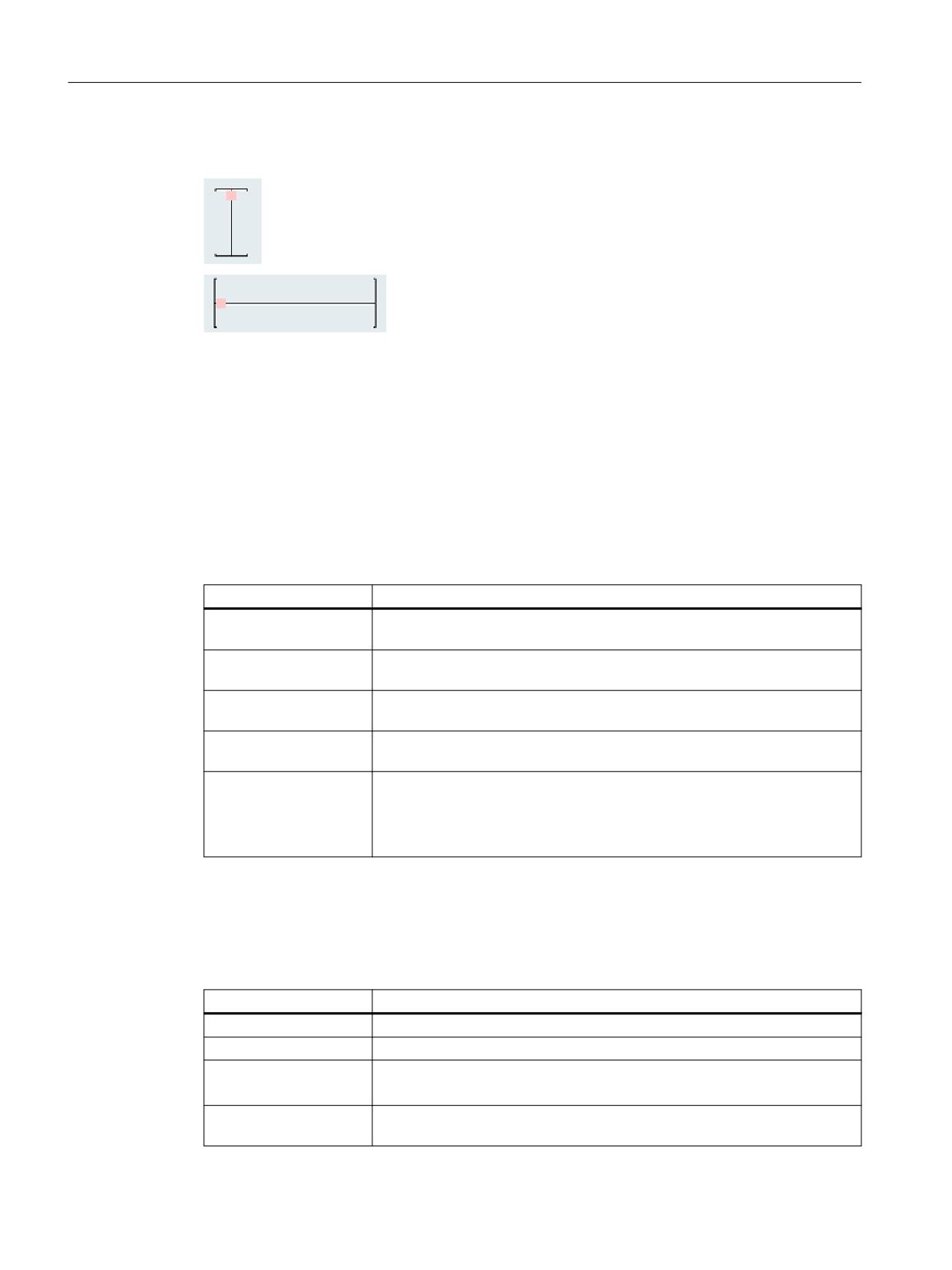
Alignment attribute
Vertical switch: Value vr
Horizontal switch: Value hr
1.12.4
Functions of the switch
1.12.4.1
Properties for the switch
Tag property
The following switch positions can be assigned to the control with the property tag:
Attribute
Meaning/behavior
left_position
The value of the attribute is assigned to the control variable if the switch was
moved to the left.
right_position
The value of the attribute is assigned to the control variable if the switch was
moved to the right.
upper_position
The value of the attribute is assigned to the control variable if the switch was
moved up.
lower_position
The value of the attribute is assigned to the control variable if the switch was
moved down.
disabled
The attribute controls whether or not the switch can be operated.
If the value is true, a control action is not evaluated.
Changes in state caused by an assigned reference variable result in updat-
ing of the switching state.
The final switch design must be determined by specifying further attributes. These attributes
must be defined together with the attribute left_position, right_position, upper_position or
lower_position.
Any desired outline can be generated for the switch by declaring one color as a transparent
color with the transparent attribute.
Attribute
Meaning/behavior
picture
Icon in foreground Name of the icon for the "not pressed" state
pictureDisabled
Icon in foreground Name of the icon for the "disabled" state
transparent
The attribute value includes the color value of the transparent color.
This color value is used for all icons assigned to the switch.
caption
The attribute value includes the text associated with the switch position. This
text is displayed on the element and limited by the dimensions of the switch.
Easy XML
184
Programming Manual, 12/2019, 6FC5397-1DP40-6BA3
Generating user dialogs
1.12 Configuring your own buttons
1.12.4.2
Control variables for the switch
Switch properties can be subsequently changed by assigning new values to the control
variables listed below. The values are assigned in an operation instruction by specifying the
control name followed by the control variable name. The two names must separated by a
period.
Syntax
<Control-Name>.<Control-Variable>
Control variable
Meaning/behavior
Left_position
Variable type: Int
The value of the attribute is assigned to the control
variable if the switch was moved to the left.
Right_position
Variable type: Int
The value of the attribute is assigned to the control
variable if the switch was moved to the right.
Lower_position
Variable type: Int
The value of the attribute is assigned to the control
variable if the switch was moved down.
Upper_position
Variable type: Int
The value of the attribute is assigned to the control
variable if the switch was moved up.
Picture_left_position
Variable type: String
Name of icon for the left-hand position
Picture_right_position
Variable type: String
Name of icon for the right-hand position
Picture_upper_position
Variable type: String
Name of icon for the upper position
Picture_lower_position
Variable type: String
Name of icon for the lower position
Picturedisabled_left_position
Variable type: String
Name of icon for the left-hand position "disabled
state"
Picturedisabled_right_position
Variable type: String name of icon for the right-
hand position "disabled state"
Picturedisabled_upper_position
Variable type: String
Name of icon for the upper position "disabled state"
Picturedisabled_lower_position
Variable type: String
Name of icon for the lower position "disabled state"
Caption_left_position
Variable type: String
Text in the left-hand position
Caption_right_position
Variable type: String
Text in the right-hand position
Easy XML
Programming Manual, 12/2019, 6FC5397-1DP40-6BA3
185
Generating user dialogs
1.12 Configuring your own buttons
Control variable
Meaning/behavior
Caption_upper_position
Variable type: String
Text in the upper position
Caption_lower_position
Variable type: String
Text in the lower position
disabled
Variable type: Bool
Value:
1 = true - switch disabled
0 = false - switch can be operated
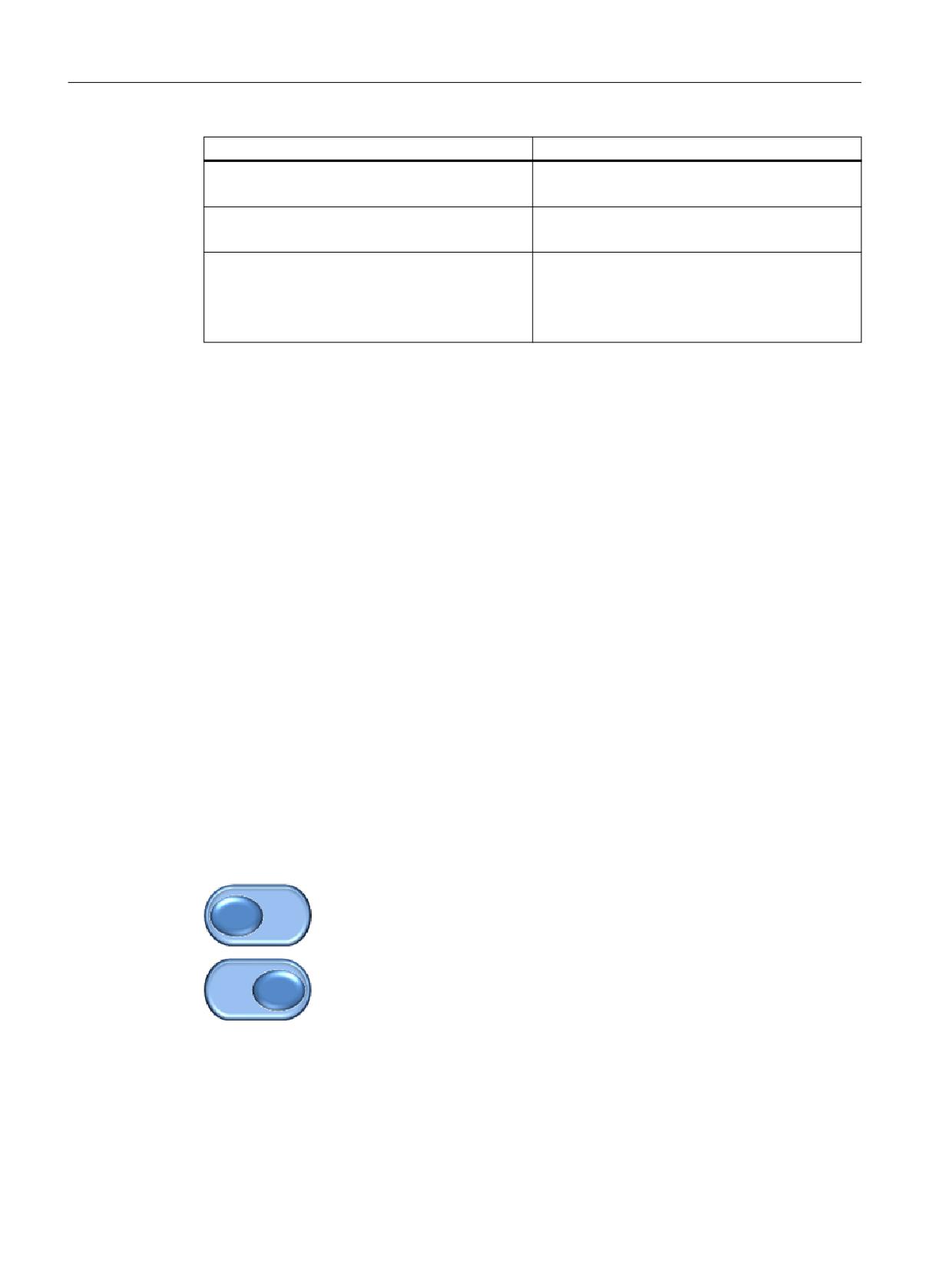
Horizontal display
<control name="name" xpos="x position" ypos="y position"
width="width" height="height" fieldtype="switch" alignment="hr">
<property left_position="value" picture="name" />
<property right_position="value" picture="name" />
</control>
Vertical display
<control name="name" xpos="x position" ypos="y position"
width="width" height="height" fieldtype="switch" alignment =“vr“>
<property upper_position="value" picture="name" />
<property lower_position="value" picture="name" />
</control>
Or assign handler function
<control name="name" xpos="x position" ypos="y position"
width="width" height="height" fieldtype="switch"
function="switch_handler" hotlink="true" alignment ="vr">
</control>
Example
icon_left.bmp
icon_right.bmp
<let name="switch_state" />
<control name="main_switch" xpos="100" ypos="53" width="40"
height="30" fieldtype="switch" refvar="switch_state" hotlink="true"
alignment="hr">
<property left_position=“10“ picture=“icon_left.bmp“ />
<property right_position=“11“ picture=“icon_right.bmp“ />
Easy XML
186
Programming Manual, 12/2019, 6FC5397-1DP40-6BA3
Generating user dialogs
1.12 Configuring your own buttons
</control>
Assigning properties by means of control variables
<control name="main_switch" xpos = "450" ypos="340" width="20"
height="46" fieldtype="switch" refvar="switch_statebf"
hotlink="true" alignment="vr">
<property upper_position="1" />
<property lower_position="0" />
</control>
…
…
…
<op>
main_switch.transparent = #ffffff;
main_switch.picture_upper_position = _T"switch_up.png";
main_switch.picture_lower_position = _T"switch_bottom.png";
main_switch.disable= 1;
</op>
1.12.5
Radio button
Radio buttons enable the selection of one of a number of options. A button must be created for
each option. All radio buttons belonging to one form, groupbox or scroll area interact with one
another in such a way that only one button is marked as selected. The button states are
transferred to the control variables.
Syntax
<control name="name" xpos="x position" ypos="y position"
width="width" height="height" fieldtype="radiobutton"
>
<caption>button text</caption>
</control>
1.12.6
Checkbox
Checkboxes enable the selection of a number of options. A button must be created for each
option. The state of the checkbox is transferred to the control variable.
Syntax
<control name="name" xpos="x position" ypos="y position"
width="width" height="height" fieldtype="checkbox"
>
<caption>button text</caption>
</control>
Easy XML
Programming Manual, 12/2019, 6FC5397-1DP40-6BA3
187
Generating user dialogs
1.12 Configuring your own buttons
1.12.7
Groupbox
A groupbox optically encloses a group of controls with a frame and and a title. It groups logically
related controls that are only intended to interact within the group. The coordinates of the
embedded controls refer to the upper left-hand corner below the title line.
All of the controls belonging to the group are embedded into the control tag as sub-controls.
When assigning the embedded control names and the Item_Data value, it is important to note
that they must be unique with respect to all controls belonging to the form.
The title of the groupbox is specified with the caption tag.
Syntax
<control name="name" xpos="x position" ypos="y position"
width="width" height="height" fieldtype="groupbox">
<caption>caption text</caption>
<control>…</control>
…
…
…
</control>
Easy XML
188
Programming Manual, 12/2019, 6FC5397-1DP40-6BA3
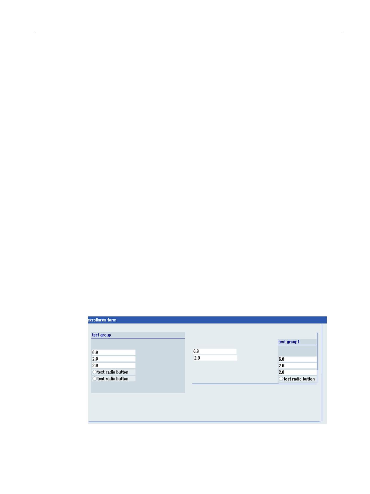
Generating user dialogs
1.12 Configuring your own buttons
1.12.8
Scroll area
A scroll area is used to display controls within a specified area. The coordinates of the
embedded controls refer to the upper left-hand corner of the scroll area. If controls are created
outside of the visible area, moving the visible area is enabled. All of the controls belonging to
the area must be embedded into the control tag as sub-controls.
When assigning the embedded control names and the Item_Data value, it is important to note
that they must be unique with respect to all controls belonging to the form.
Syntax
<control name="name" xpos="x position" ypos="y position"
width="width" height="height" fieldtype="scrollarea">
<control>…</control>
…
…
…
</control>
Touch operation
If focus is placed on a control that is currently not completely visible, the visible area is moved
until the control can be displayed in full.
Tab gesture
This gesture is forwarded to the script if the gesture cannot be assigned to an embedded
control.
Example
Nested scroll areas
<let name="CB1" >1</let>
Easy XML
Programming Manual, 12/2019, 6FC5397-1DP40-6BA3
189
Generating user dialogs
1.12 Configuring your own buttons
<let name="RB1" />
<form name="scrollarea_form">
<init>
<caption>scrollarea form</caption>
<data_access type="true" />
<control name= "c_scroll" xpos = "2" ypos="24" width="520"
height="300" fieldtype="scrollarea" >
<control name= "c_group" xpos = "6" ypos="24" width="208"
height="186" fieldtype="groupbox" >
<caption>test group</caption>
<control name = "c18" xpos = "2" ypos = "54" refvar="nck/Channel/
Parameter/R[1]" hotlink="true" />
<control name = "c19" xpos = "2" ypos = "74" refvar="nck/Channel/
Parameter/R[2]" hotlink="true" />
<control name = "c20" xpos = "2" ypos = "94" refvar="nck/Channel/
Parameter/R[3]" hotlink="true" />
<control name="radiobg" xpos = "2" ypos="114"
fieldtype="radiobutton" >
<caption>test radio button</caption>
<property backg12roundpicture="f:\appl\cycle_my1.png" />
</control>
<control name="radiobg1" xpos = "2" ypos="134"
fieldtype="radiobutton" >
<caption>test radio button</caption>
<property backg12roundpicture="f:\appl\cycle_my1.png" />
</control>
</control>
<control name= "c_scroll_emb" xpos = "230" ypos="24" width="280"
height="160" fieldtype="scrollarea" >
<control name = "c18emb" xpos = "2" ypos = "54" refvar="nck/Channel/
Parameter/R[1]" hotlink="true" />
<control name = "c19emb" xpos = "4" ypos = "74" refvar="nck/Channel/
Parameter/R[2]" hotlink="true" />
<control name = "c20emb" xpos = "3" ypos = "194" refvar="nck/Channel/
Parameter/R[3]" hotlink="true" />
<control name= "c_group1" xpos = "190" ypos="24" width="208"
height="186" fieldtype="groupbox" >
<caption>test group1</caption>
<control name = "c18gemb" xpos = "2" ypos = "54" refvar="nck/Channel/
Parameter/R[1]" hotlink="true" />
<control name = "c19gemb" xpos = "2" ypos = "74" refvar="nck/Channel/
Parameter/R[2]" hotlink="true" />
<control name = "c20gemb" xpos = "2" ypos = "94" refvar="nck/Channel/
Parameter/R[3]" hotlink="true" />
<control name="radiobggemb" xpos = "2" ypos="114"
fieldtype="radiobutton" >
<caption>test radio button</caption>
<property backg12roundpicture="f:\appl\cycle_my1.png" />
</control>
Easy XML
190
Programming Manual, 12/2019, 6FC5397-1DP40-6BA3
Generating user dialogs
1.12 Configuring your own buttons
<control name="radiobg1emb" xpos = "2" ypos="134"
fieldtype="radiobutton" >
<caption>test radio button</caption>
<property backg12roundpicture="f:\appl\cycle_my1.png" />
</control>
</control>
</control>
<control name = "c22" xpos = "2" ypos = "400" refvar="nck/Channel/
Parameter/R[12]" hotlink="true" />
<control name="ChB1" xpos="208" ypos="430" width="50" height="30"
fieldtype="checkbox" refvar="PLC/M100.7" hotlink = "true"
color_bk="#00ffff">
<caption>Check1</caption>
</control>
<control name="ChB2" xpos="208" ypos="460" width="58" height="30"
fieldtype="checkbox" refvar="PLC/M100.6" hotlink = "true"
color_bk="#00ffff">
<caption>Check2</caption>
</control>
<control name="Radio1" xpos="208" ypos="490" width="40"
height="30" fieldtype="radiobutton" refvar="PLC/M100.0" hotlink =
"true" color_bk="#00ffff">
<caption>Radio1</caption>
</control>
<control name="Radio2" xpos="208" ypos="520" width="45"
height="30" fieldtype="radiobutton" refvar="PLC/M100.1" hotlink =
"true" color_bk="#00ffff">
<caption>Radio2</caption>
</control>
<control name="Radio3" xpos="208" ypos="550" width="50"
height="30" fieldtype="radiobutton" refvar="PLC/M100.2" hotlink =
"true" >
<caption>Radio3</caption>
</control>
<control name="VChB1" xpos="8" ypos="430" width="50" height="30"
refvar="PLC/MB100" hotlink = "true" color_bk="#00ffff"/>
<control name="VChB2" xpos="8" ypos="465" width="53" height="30"
refvar="PLC/MB100" hotlink = "true" color_bk="#00ffff"/>
</control>
<control name="ChB3" xpos="208" ypos="340" width="60" height="30"
fieldtype="checkbox" refvar="CB1" >
<caption>Check3</caption>
</control>
</init>
<timer>
</timer>
</form>
Easy XML
Programming Manual, 12/2019, 6FC5397-1DP40-6BA3
191
Generating user dialogs
1.13 Sidescreen application
1.13
Sidescreen application
1.13.1
Easy XML in the Sidescreen
The Easy XML scripting language can also be used to create dialogs in the Sidescreen area.
The Sidescreen components Page and Widget are available for displaying the dialogs. The
connection is made via the slsidescreen.ini file. Sidescreen components are automatically
started when the operating software starts up and are only terminated when the system shuts
down. This means that the parser loads the assigned scripts once when the Sidescreen
component is activated for the first time.
The dimension of the Sidescreen area is determined by the layout parameters from the
slsidescreen_<screen resolution>.ini file. To enable independent configuration, the usable
width for Easy XML scripts is 276 pixels. The usable height of an Easy XML dialog depends on
the Sidescreen component used. For a page, 768 pixels are available. For a widget, the height
is determined by the Sidescreen management and can be queried with the GETHMIResolution
function.
The script parser expects a menu to activate a shape or branch to other shapes. The main
menu must be named main. Sidescreen does not support softkey tags, so that you need to
navigate to other shapes using an operator control for the shape.
The number of Sidescreen pages or Sidescreen widgets is not limited by the parser.
Easy XML
192
Programming Manual, 12/2019, 6FC5397-1DP40-6BA3
Generating user dialogs
1.13 Sidescreen application
1.13.2
Integrating Sidescreen dialogs
The pages or widgets are integrated using the slsidescreen.ini file.
Pages are entered in the [Sidescreen] section. Each page must be specified with the keyword
PAGE followed by the sequential page number and the required attributes. The name attribute
defines the object name of the page. The implementation attribute specifies the implementation
library and the class name. Both attributes must be separated by a comma. SlSideScreenPage
type pages can include Sidescreen elements. This is done via the "ELEMENT" entries. The rule
for creating an ELEMENTxxx element line corresponds to the rule for creating a page. If a page
should only contain dialogs that were configured with Easy XML,
slagmforms.SlEESideScreenPage should be specified as value for the implementation
attribute.
Widgets can be added to a Sidescreen element in the section [Element_<name>].
The rule for creating a WIDGETxxx widget line corresponds to the rule for creating a page.
If an Easy XML Sidescreen widget is to be activated, slagmforms.SlEESideScreenWidget
should be specified as the value for the implementation attribute.
Syntax
ELEMENT002= name:=<name>, implementation:=SlSideScreenElement
…
…
[Element_<name>]
WIDGET001= name:=<Widget Name>, implementation:=
slagmforms.SlEESideScreenWidget
The widget identifier is used by default to form the main module name.
Example
PAGE004= name:=sidescreen_proginfluence,
implementation:=slagmforms.SlEESideScreenPage
Main module name: sidescreen_proginfluence.xml
Additional properties
Additional properties can be assigned to the pages or widgets by entering a section
named PAGE_<pagename>, ELEMENT_<elmentname> or WIDGET_<widgetname> in the
file slsidescreen.ini.
The following properties can be assigned to a page, an element or a widget:
Attribute
Meaning/behavior
TextId
Language-independent identifiers of the text
TextFile
Text file name
TextContext
Text context EASY_XML
Icon
Name of the icon
Easy XML
Programming Manual, 12/2019, 6FC5397-1DP40-6BA3
193
Generating user dialogs
1.13 Sidescreen application
Property
Meaning/behavior
maskPath
The property specifies the main module name to use.
maskName
The property specifies the main menu name to use.
focusable
The property determines whether the input focus can be set to the element.
Example
[Page_sidescreen_proginfluence]
PROPERTY001= name:=focusable, type:=bool, value:="true"
Icon=sidescreen_proginfluence.png
[PAGE_sidescreen_proginfluence]
Icon= sidescreen_proginfluence.png
PROPERTY001= name:=focusable, type:=bool, value:="true"
PROPERTY002= name:=maskPath, type:=QString, value:="
sidescreen_proginfluence.xml"
PROPERTY003= name:=maskName, type:=QString, value:="main"
1.13.3
Language and text management
To manage the language-independent texts, each component can be assigned a text file. The
text file name is formed from the name of the component, the language version and the
extension ".ts".
EASY_XML should be used as the text context.
Syntax
<name>_<language>.ts
Example
PAGE004= name:=sidescreen_proginfluence,
implementation:=slagmforms.SlEESideScreenPage
Text file name: sidescreen_proginfluence_eng.ts
If no text file is specified, the parser searches for the text identifier in the
oem_xml_screens_xxx.ts default text file.
Easy XML
194
Programming Manual, 12/2019, 6FC5397-1DP40-6BA3
Generating user dialogs
1.13 Sidescreen application
1.13.4
Sidescreen components
1.13.4.1
Sidescreen element
If a page is linked to the default implementation, elements can be assigned to this page.
A [Page_<page_name>] section is to be created for this and all elements associated with the
page are listed.
Example
[Sidescreen]
PAGE001= name:=<page_name>, implementation:=SlSideScreenPage
[Page_<page_name>]
ELEMENT<number>= name:=<Element name>,
implementation:=SlSideScreenElement
Each element requires an [Element_<element name>] section in which the properties and
associated widgets are listed.
[Element_<element_name>]
WIDGET001= name:=<widget_name>, implementation:= <implementation>
Easy XML
Programming Manual, 12/2019, 6FC5397-1DP40-6BA3
195
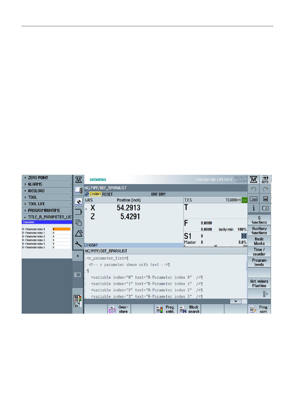
Generating user dialogs
1.13 Sidescreen application
1.13.4.2
Sidescreen widget
A widget is assigned an area by the Sidescreen management in which the configured shapes
can be displayed. By default, a widget does not obtain an input focus so that fields cannot be
edited. This behavior can be changed by specifying the focusable attribute. When the widget
opens, the parser opens the form associated with the main menu. Within the form, the user can
branch out to other menus with a navigation instruction.
Example
The Easy XML script searches for the description for the data content of the widget in the active
part program. In this specific example, the description of a list with R parameters is expected
that are to be displayed. Each parameter can be assigned a description text.
Toolbox example
Custom Screen Sample\
side_screen_examples\sidescreenwidget\displayRparameter\rparameter_widget.xml
If another part program is selected, the widget is automatically reworked.
Easy XML
196
Programming Manual, 12/2019, 6FC5397-1DP40-6BA3
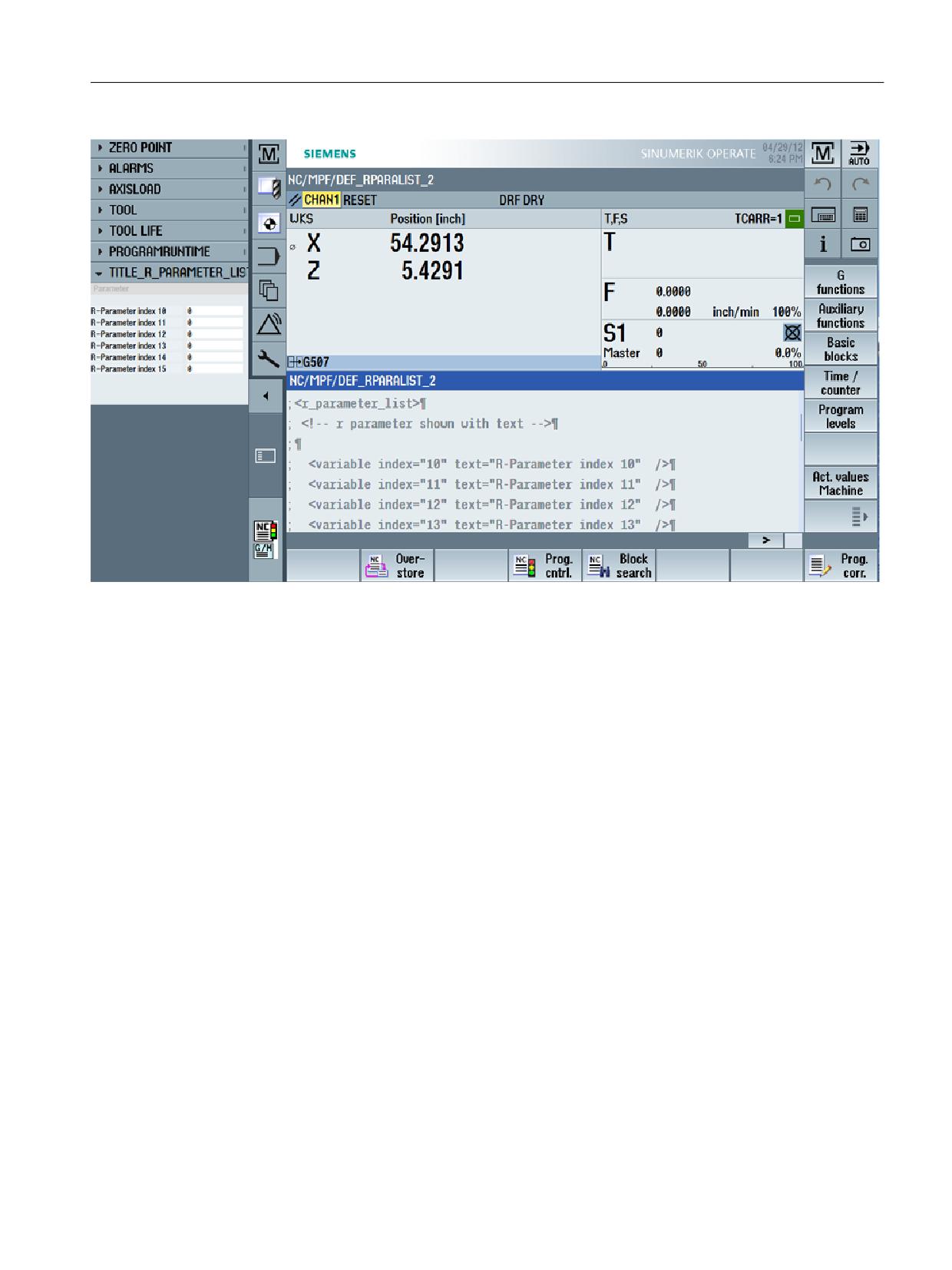
Generating user dialogs
1.13 Sidescreen application
Easy XML
Programming Manual, 12/2019, 6FC5397-1DP40-6BA3
197
Generating user dialogs
1.13 Sidescreen application
1.13.4.3
Sidescreen page
A page, which is started via the slagmforms.SlEESideScreenPage implementation, makes
available the entire Sidescreen area of a form. It has no title line so that a heading cannot be
configured with the Caption statement. By default, a page does not obtain an input focus so that
fields cannot be edited. This behavior can be changed by specifying the focusable attribute.
When the page opens, the parser opens the form associated with the main menu. Within the
form, the user can branch out to other menus with a navigation instruction.
Example
The Sidescreen page is displayed as page which only shows an Easy XML form.
In this example, additional information is displayed in the Sidescreen area.
Toolbox example
Custom Screen Sample\side_screen_examples\sidecreenpage\sidescreen_proginfluence.xml
[Sidescreen]
PROPERTY001= name:=minimizable, type:=bool, value:="true"
PROPERTY002= name:=buttonBarVisible, type:=bool, value:="true"
PAGE001= name:=WidgetsPage, implementation:=SlSideScreenPage
PAGE004= name:=sidescreen_proginfluence,
implementation:=slagmforms.SlEESideScreenPage
Easy XML
198
Programming Manual, 12/2019, 6FC5397-1DP40-6BA3